5. Next-level Data Visualization#
Learning Objectives
Describe Matplotlib
Describe and identify the components of a Matplotlib Figure
Describe a Matplotlib Axes
Explain the difference between Matplotlib’s explicit and implicit interfaces
Create Matplotlib Figures and Axes
Modify Matplotlib plots with Figure and Axes methods
Describe Matplotlib’s coding styles
Choose appropriate visualizations based on data type(s)
List the steps to making a well-designed visualization
Assess what aspects of a visualization need improvement
Use Matplotlib to customize visualizations made with other packages
Create well-designed data visualizations
This chapter is about customizing data visualizations in Python. Seaborn, plotnine, pandas, and many other packages rely on the Matplotlib package to create visualizations. Thus the first section delves into Matplotlib’s interfaces and computational model: how to reason about and modify visualizations created with the package. The second section puts the ideas from the first into practice by presenting a selection of case studies with real data, where creating a great visualization depends on customizing the default outputs from Seaborn with some Matplotlib code.
5.1. Prerequisites#
This chapter assumes you are already familiar with Python, pandas, and at least
one way of making data visualizations. In particular, you should be comfortable
working with DataFrames and creating scatter, line, and bar plots from data.
DataLab’s Python Basics Reader and its accompanying workshop
provide a suitable introduction to these topics.
To follow along, you’ll need the following software versions (or newer) installed on your computer:
One way to install all of these at once is to install the Anaconda Python
distribution. Chapter {number} provides
additional details about Anaconda and the conda package manager.
5.2. Thinking in Matplotlib#
Matplotlib is a relatively low-level visualization package, which means you can use it to draw almost anything, but that creating and fine-tuning common statistical plots usually requires more code than with other packages. The package has extensive documentation, including tutorials and cheat sheets. While the size of Matplotlib’s programming interface can be daunting, there’s an ongoing effort to make it more user-friendly and make the documentation more approachable, and there have already been big improvements in the last three years.
Note
This section is loosely based on Matplotlib’s Quick Start Guide.
5.2.1. Introduction#
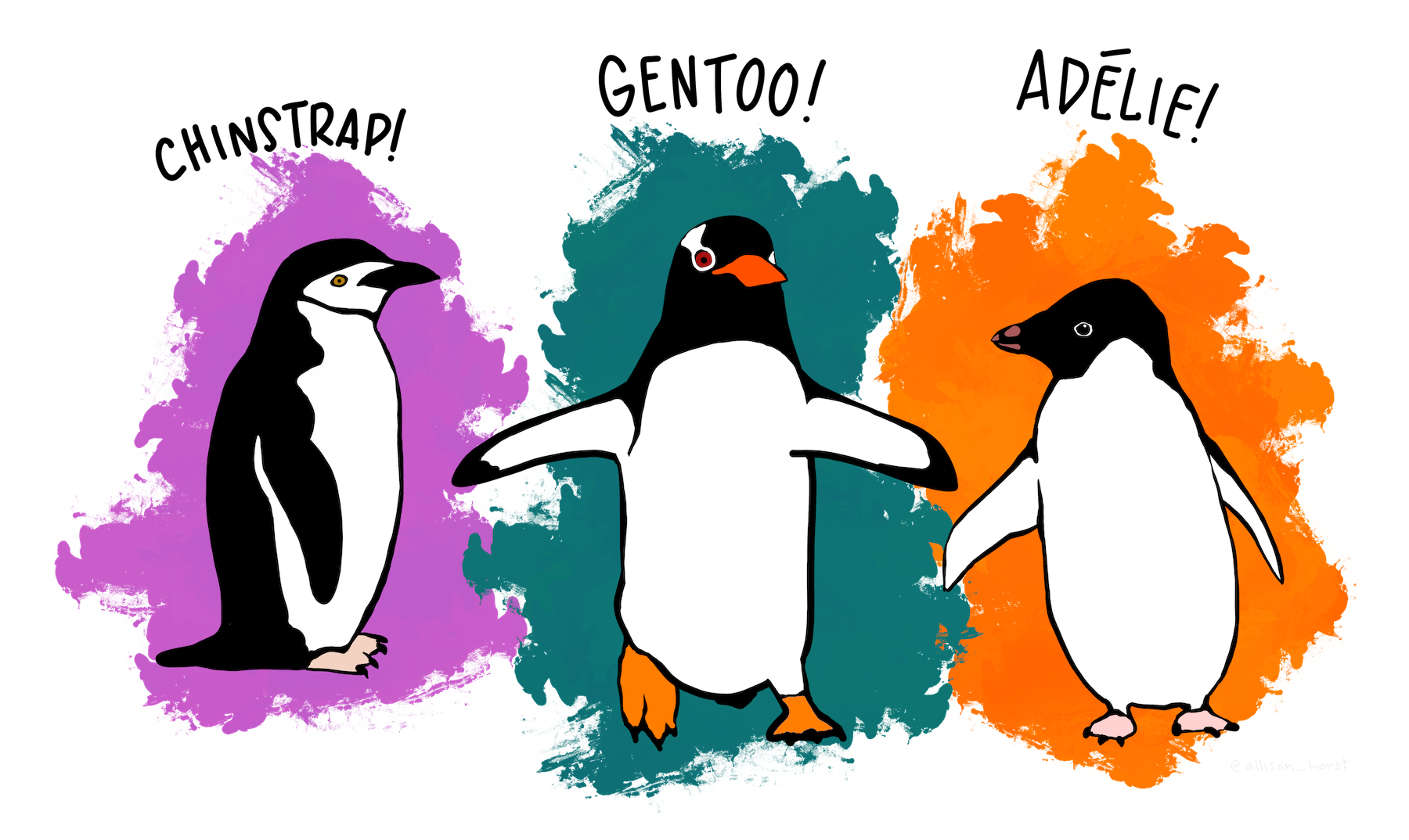
Fig. 5.1 Artwork by @allison_horst.#
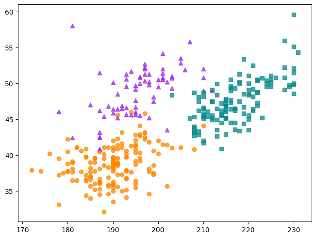
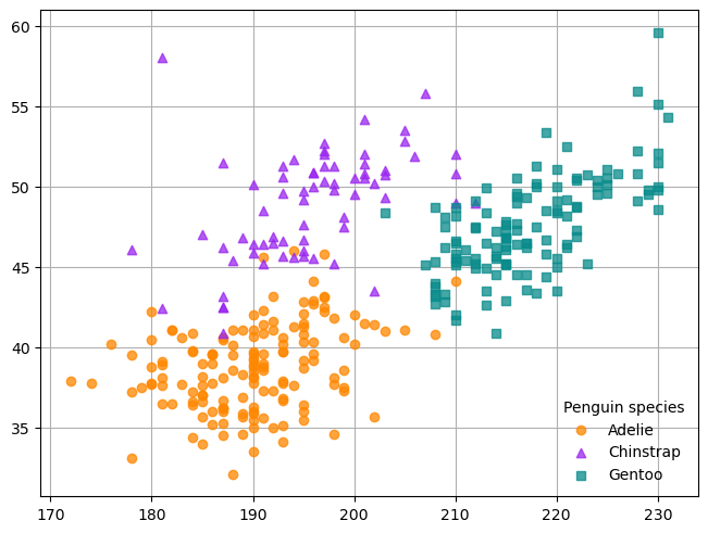
As a way to learn the fundamentals of Matplotlib, you’ll recreate the scatter plot (without the regression lines) in Fig. 5.2, which shows flipper length versus bill length for hundreds of individual penguins from three different species: Adélie, Chinstrap, and Gentoo. Both the plot and data come from the Palmer Penguins data set, which was collected by Dr. Kristen Gorman at Palmer Station, Antarctica, and packaged for public use by Alison Horst.
Important
You can download a version of the Palmer Penguins data set that we’ve prepared for Python HERE.
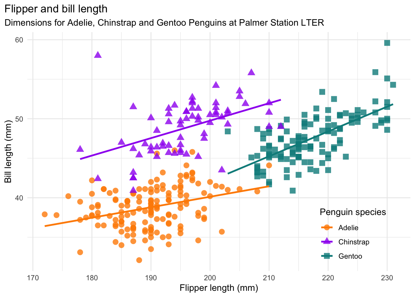
Fig. 5.2 A scatter plot from the Palmer Penguins data set.#
After downloading the data set, use pandas to read it and display some summary information:
import pandas as pd

penguins = pd.read_parquet("data/penguins.parquet")
penguins.head()
| species | island | bill_length_mm | bill_depth_mm | flipper_length_mm | body_mass_g | sex | year | |
|---|---|---|---|---|---|---|---|---|
| 0 | Adelie | Torgersen | 39.1 | 18.7 | 181.0 | 3750.0 | male | 2007 |
| 1 | Adelie | Torgersen | 39.5 | 17.4 | 186.0 | 3800.0 | female | 2007 |
| 2 | Adelie | Torgersen | 40.3 | 18.0 | 195.0 | 3250.0 | female | 2007 |
| 3 | Adelie | Torgersen | NaN | NaN | NaN | NaN | NaN | 2007 |
| 4 | Adelie | Torgersen | 36.7 | 19.3 | 193.0 | 3450.0 | female | 2007 |
penguins.info()
<class 'pandas.core.frame.DataFrame'>
RangeIndex: 344 entries, 0 to 343
Data columns (total 8 columns):
 #   Column             Non-Null Count  Dtype
---  ------             --------------  -----
 0   species            344 non-null    category
 1   island             344 non-null    category
 2   bill_length_mm     342 non-null    float64
 3   bill_depth_mm      342 non-null    float64
 4   flipper_length_mm  342 non-null    float64
 5   body_mass_g        342 non-null    float64
 6   sex                333 non-null    category
 7   year               344 non-null    int32
dtypes: category(3), float64(4), int32(1)
memory usage: 13.6 KB
Matplotlib’s primary interface for creating plots interactively is PyPlot
(matplotlib.pyplot). The convention is to import PyPlot as plt:
import matplotlib.pyplot as plt
PyPlot’s plt.scatter function creates a scatter plot. The first and second
argument set the x and y axis, respectively. For the plot in
Fig. 5.2, penguin flipper length should be on the x-axis and bill
length should be on the y-axis. Use the plt.scatter function to create the
plot:
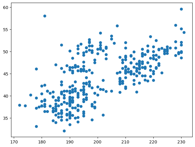
plt.scatter(penguins["flipper_length_mm"], penguins["bill_length_mm"])
<matplotlib.collections.PathCollection at 0x72d54556b0e0>
This austere scatter plot is typical of Matplotlib functions: if you want fancy formatting, you have to set more parameters and make more function calls.
Note
If you’re using Jupyter, notice that in addition to the plot, there’s also some
output about a matplotlib.collections.PathCollection. This happens because
most Matplotlib functions and methods return a result—typically the object
you added to the plot—and Jupyter prints the last result in each code cell.
The output is harmless and safe to ignore, but if it bothers you, you can add a
call to plt.show at the end of each cell where you make a plot.
Tip
Most Matplotlib plotting functions provide an alternative interface through the
data parameter for string-indexed data such as data frames and dicts. For
instance, if you set data = penguins in the plt.scatter function, then you
can use column names to set the x and y axis:
plt.scatter("flipper_length_mm", "bill_length_mm", data = penguins)
How much formatting a plot requires depends on the intended audience, but even if you’re only making the plot for yourself, you might want to put some axis labels on it to remind you of what it’s showing. You might also want to make the points partially transparent so that you can see whether any points are hidden under others and use point styles to incorporate additional information from the data set. If you’re making a plot to share with others, you might also want to add a title and go through DataLab’s Data Visualization Guidelines.
Eventually you’ll customize the penguin scatter plot, but first you need to know a little bit more about how Matplotlib works.
5.2.2. Figures & Axes#
Matplotlib uses specific terms for the components of a visualization which can be confusing if you aren’t aware of them. The most important terms are:
Artist: any Matplotlib object, including the other items on this list.Figure: an entire visualization. A Figure can contain one or more plots. You’ll typically interact with Figures when you want to set margins on, display, or save a visualization.Axes: a single plot. An Axes can contain many other Artists. You’ll typically interact with Axes when you want to add additional data or customize the components (styles, colors, and so on) of a plot.
Important
Despite the name, an Axes object represents an entire plot (within a larger
visualization), not the axes on a plot. The represented plot might not even
have visible axes.
Each axis on a plot is represented by a separate Axis object (with an “i”).
Note
In this reader, we use monospace (Axes) or title-case (Axes) to refer to
Python classes and lowercase (axes) for plain English.
Thus in Matplotlib terms, a visualization consists of a Figure with at least one Axes. Both are Artists, and an Axes usually contains additional Artists for lines, points, axes, legends, and so on. Fig. 5.3 identifies Matplotlib terms on an actual visualization. Keep it or the cheat sheet at hand as you’re learning the package.
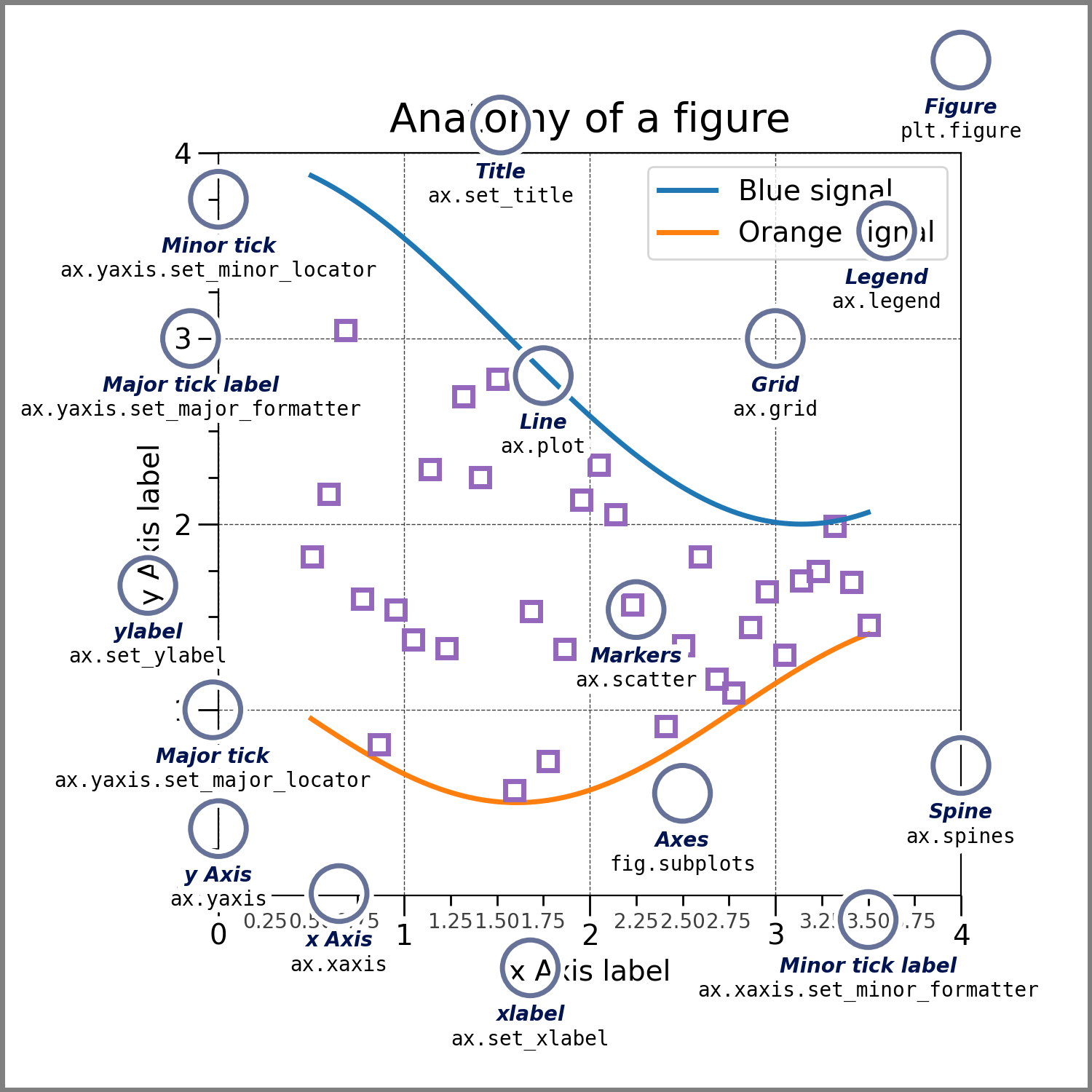
Fig. 5.3 The anatomy of a Matplotlib figure.#
The plt.subplots function creates a Figure with one or more Axes arranged in
a grid, so it’s the starting point for most visualizations. The function
returns a tuple with the Figure and the Axes. By default, it only creates one
Axes:
fig, ax = plt.subplots()
Warning
Matplotlib also has a plt.subplot function (without the final
“s”). It adds an Axes to an existing Figure rather than creating a new Figure
and Axes. To create a new visualization, the plt.subplots
function (with the final “s”) is the one you want.
Once you’ve created a Figure and Axes, you can call methods on the Axes to add
details. Section 5.2.1 explained how to create a scatter plot of
the Palmer Penguins data set with the plt.scatter function. Another approach
is to use the .scatter method on an Axes instead:
fig, ax = plt.subplots()
ax.scatter(penguins["flipper_length_mm"], penguins["bill_length_mm"])
<matplotlib.collections.PathCollection at 0x72d5454d0910>
Section 5.2.3 provides more information about these two different approaches to creating plots.
The first two arguments to plt.subplots control the number of rows and number
of columns, respectively, in the grid of Axes. When the grid contains more than
one Axes, the Axes are returned in a 2-dimensional Numpy array:
fig, axs = plt.subplots(2, 3)
axs
array([[<Axes: >, <Axes: >, <Axes: >],
       [<Axes: >, <Axes: >, <Axes: >]], dtype=object)
You can index this array with square brackets [ ] in order to get the
individual Axes. For example, axs[0, 2] gets the Axes in the first row and
third column.
Tip
If you want make a visualization where some subplots span multiple grid cells,
take a look at the plt.subplot_mosaic function. You can
use it to concisely describe and create Figures with complex arrangements of
Axes.
Notice that in the displayed Figure, there’s not much space between the
components and some of them even overlap. You can tell Matplotlib to use a
constraint solver to determine appropriate sizes for each
subplot by setting layout = "constrained" on the Figure. The plt.subplots
function accepts Figure-level keyword arguments, so one way to do this is:
fig, axs = plt.subplots(2, 3, layout = "constrained")
Note
Constrained layout is not the only layout possible, and you may encounter visualizations that use tight layout instead. According to the Matplotlib developers, constrained layout produces better results in most cases.
You can control the size of an entire Figure with another setting, figsize.
The argument should be a tuple with a width and height of the Figure in inches.
This can also be set through plt.subplots:
fig, ax = plt.subplots(figsize = (1, 2))
The Matplotlib documentation has a reference page with a list of other Figure-level keyword arguments.
Tip
You can change Figure settings globally through mpl.rcParams, which is a
dict-like object. See the documentation page and the
guide for more details.
5.2.3. Coding Styles#
Section 5.2.1 and Section 5.2.2 explained two different ways to create a scatter plot. Matplotlib actually supports three different coding styles, two of which use the PyPlot interface:
PyPlot style, where you use the PyPlot interface for everything, from plot creation to customization. This style is convenient for interactive work in the Python console because you don’t have to keep track of any intermediate variables—you just use
plt.Object-oriented (OO) style, where you only use the PyPlot interface to create the
FigureandAxes, and then use method calls to add detail and customize.Embedded style: where you don’t use the PyPlot interface at all. Instead, you create a
Figureby explicitly calling theFigureconstructor function and attaching a canvas, and then use method calls to addAxesand details. This style is convenient for non-interactive work, because it allows greater control over where Figures are drawn.
Warning
When you use either the PyPlot or OO style, it’s up to you to explicitly close
Figures by calling plt.close when you’re done with them. If you create many
Figures without closing them, Python may run out of memory. Matplotlib will
automatically issue a warning if you have more than 20 Figures open.
When you use the embedded style, Python will automatically close Figures when
they go out of scope. If you need to close a Figure before it goes out of
scope, you can use the del keyword.
Warning
Many PyPlot functions and Axes methods have the same names and signatures, but not all of them. So translating between the PyPlot style and OO style sometimes requires searching the documentation even if you have one style memorized.
The Matplotlib documentation suggests using the OO style in most scenarios. For scripts that are intended to run non-interactively and save many plots to disk, the embedded style is usually more memory efficient. Switching between the OO and embedded style is relatively easy, since the only major difference is in how Figures and Axes are created. Thus we recommend the OO style and use it in all of the remaining examples.
5.2.4. Drawing on Axes#
Matplotlib provides Axes methods for drawing points, lines, text, legends, shapes, and more. In this section, you’ll use some of these methods to add detail to the scatter plot of the Palmer Penguins data set, so that it looks more like Fig. 5.2. Section 5.2.2 left off with this version of the plot:
fig, ax = plt.subplots(layout = "constrained")
ax.scatter(penguins["flipper_length_mm"], penguins["bill_length_mm"])
<matplotlib.collections.PathCollection at 0x72d5450e4910>
In Fig. 5.2, the shape and color of each point indicates the species of penguin. Orange circles represent Adelie penguins, purple triangles represent Chinstrap penguins, and teal squares represent Gentoo penguins.
You can set the shape of the points plotted by the .scatter method with the
marker parameter. Matplotlib uses shorthand strings to represent different
marker types. For instance, "o" means a circle, and "^" means a point-up
triangle, and "s" means a square. The documentation includes a complete list
of markers.
When you call the .scatter method, you can only set one shape for the points.
To plot a different shape for each group, make a separate call to .scatter
for each group. For example, to plot only the points for the Chinstrap
penguins:
fig, ax = plt.subplots(layout = "constrained")

obs = penguins[penguins["species"] == "Chinstrap"]
ax.scatter(obs["flipper_length_mm"], obs["bill_length_mm"], marker = "^")
<matplotlib.collections.PathCollection at 0x72d545147250>
You can use a dictionary and a loop to concisely plot multiple groups:
fig, ax = plt.subplots(layout = "constrained")

groups = {"Adelie": "o", "Chinstrap": "^", "Gentoo": "s"}
for species, marker in groups.items():
    obs = penguins[penguins["species"] == species]
    ax.scatter(
        obs["flipper_length_mm"], obs["bill_length_mm"], marker = marker)
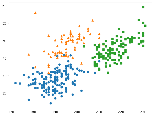
When you call the .scatter method many times like this, Matplotlib
automatically cycles through the colors in its default palette. The package
also does this for most other kinds of plots.
Note
In computing contexts, colors are often described in terms of their percentages
of red, green, and blue (RGB) light or channels. You can write this as a
tuple of decimal numbers, each between 0.0 and 1.0. For example, (0, 0, 0) is
black, (1, 1, 1) is white, (0.5, 0, 0.5) is purple, and (0, 0.5, 0.5) is
teal.
For memory efficiency, each color channel is usually limited to 256 different
values (8 bits per channel, or 24-bit color). In this case, you can write a
color as a tuple of integers. For instance, (128, 0, 128) is purple.
You can write integer color codes concisely by using the base-16 number system,
called hexadecimal. In hexadecimal, each digit represents one of 16
values (0 to 15). Conventionally, the digits are written 0-9 and a-f (10-15).
Thus 8 is written as 8, 90 is written as 5a, and 255 is written as ff.
Since each color channel ranges from 0 to 255, you can write each channel with
two hex digits, and thus a whole color with six hex digits. Hex codes for
colors are usually prefixed with #, so for example #800080 is purple.
A red-green-blue-alpha (RGBA) color has a fourth channel called alpha that controls the opacity. RGBA colors are usually 32-bit colors and thus can be written with eight hex digits.
In Matplotlib, you can specify RGB and RGBA colors as hex codes. The documentation also describes several other ways to specify colors.
To explicitly set the color of the points in a call to .scatter, use the
color parameter. In Fig. 5.2, Adelie orange is approximately
#fe8700, Chinstrap purple is approximately #9a27ef, and Gentoo teal is
approximately #098b8b. The points are slightly transparent, so it’s also a
good idea to append c0 to each color code to set 75% opacity. You can add the
color codes to the groups dictionary:
fig, ax = plt.subplots(layout = "constrained")

groups = {
    "Adelie"    : ("o", "#fe8700c0"),
    "Chinstrap" : ("^", "#9a27efc0"),
    "Gentoo"    : ("s", "#098b8bc0")
}

for species, (marker, color) in groups.items():
    obs = penguins[penguins["species"] == species]

    ax.scatter(
        obs["flipper_length_mm"], obs["bill_length_mm"], marker = marker,
        color = color)
The figure also has a legend. You can add a legend to a Matplotlib Axes by
calling the .legend method. Matplotlib will guess what to show in the legend
based on the labeled components of the plot. You can set the label parameter
in the .scatter method to label a group of points. The label will be
displayed in the legend. You can also use parameters of the .legend method to
control the legend directly. For instance, title sets the title and frameon
controls whether the legend is displayed in a box. After adding a legend, the
code becomes:
fig, ax = plt.subplots(layout = "constrained")

groups = {
    "Adelie"    : ("o", "#fe8700c0"),
    "Chinstrap" : ("^", "#9a27efc0"),
    "Gentoo"    : ("s", "#098b8bc0")
}

for species, (marker, color) in groups.items():
    obs = penguins[penguins["species"] == species]

    ax.scatter(
        obs["flipper_length_mm"], obs["bill_length_mm"], marker = marker,
        color = color, label = species)

ax.legend(title = "Penguin species", frameon = False)
<matplotlib.legend.Legend at 0x72d54556b8c0>

Fig. 5.2 also has grid lines. The Axes method .grid controls
the display of grid lines. The first argument is a Boolean value that sets
whether the grid lines are visible. An Axes can have major or minor grid lines,
which correspond to the major (labeled) and minor (unlabeled) ticks on each
axis. The which parameter controls which grid lines are affected by the
.grid method. It’s necessary to also call the .set_axisbelow method if you
want the grid to appear behind other plot components rather than in front of
them. So to add major and minor grid lines:
fig, ax = plt.subplots(layout = "constrained")

groups = {
    "Adelie"    : ("o", "#fe8700c0"),
    "Chinstrap" : ("^", "#9a27efc0"),
    "Gentoo"    : ("s", "#098b8bc0")
}

for species, (marker, color) in groups.items():
    obs = penguins[penguins["species"] == species]

    ax.scatter(
        obs["flipper_length_mm"], obs["bill_length_mm"], marker = marker,
        color = color, label = species)

ax.legend(title = "Penguin species", frameon = False)
ax.set_axisbelow(True)
ax.grid(True, which = "both")
The common theme of the .scatter, .legend, and .grid methods is that all
of them draw additional components on an Axes. Some of the components you might
want to draw and the associated methods are:
Lines with
.plotor.add_linePoints with
.plotor.scatterPatches, which includes geometric shapes such as rectangles, with
.add_patchText with
.textAnnotations with
.annotateLegends with
.legendImages with
.imshow
You can learn more about drawing these components from Matplotlib’s Artists Tutorial.
5.2.5. Formatting Figures & Axes#
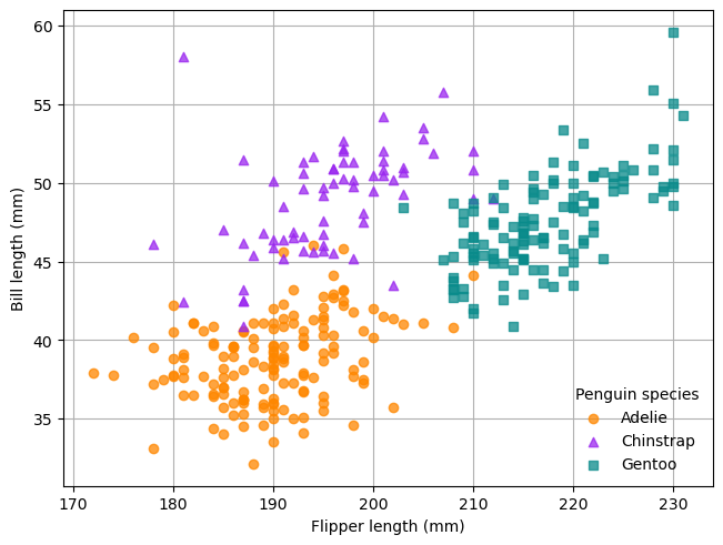
Section 5.2.4 explained how to draw the components of a plot, using the scatter plot of the Palmer Penguins data set as an example. The result was a version of the plot that has all of the information from Fig. 5.2, but not all of the formatting. You can control formatting such as borders, titles, and labels through Figure and Axes methods. This section demonstrates how.
Axis labels add important context to a plot, since they describe the meaning
and units for each axis. If you want people to use the axes when they interpret
your plot, make sure to include axis labels. You can add axis labels to the x-
and y-axis of a Matplotlib Axes with the .set_xlabel and .set_ylabel
method, respectively. For example, for the penguins scatter plot:
fig, ax = plt.subplots(layout = "constrained")

groups = {
    "Adelie"    : ("o", "#fe8700c0"),
    "Chinstrap" : ("^", "#9a27efc0"),
    "Gentoo"    : ("s", "#098b8bc0")
}

for species, (marker, color) in groups.items():
    obs = penguins[penguins["species"] == species]

    ax.scatter(
        obs["flipper_length_mm"], obs["bill_length_mm"], marker = marker,
        color = color, label = species)

ax.legend(title = "Penguin species", frameon = False)
ax.set_axisbelow(True)
ax.grid(True, which = "both")
ax.set_xlabel("Flipper length (mm)")
ax.set_ylabel("Bill length (mm)")
Text(0, 0.5, 'Bill length (mm)')
Tip
Matplotlib supports a subset of TeX, so it’s possible to use mathematical
symbols in visualizations. Any TeX expressions you enclose in dollar signs $
will be rendered. The documentation on mathematical expressions
provides more details.
Similarly, you can add a title to a Matplotlib Axes with the .set_title
method. It’s particularly important to put titles on plots that will be
presented without other sources of contextual information, such as captions.
Each Axes can have up to three titles, positioned at the left, center, and
right. The loc parameter of .set_title controls which title is set. The
title can have multiple lines, as in Fig. 5.2. With the title,
the penguins plot becomes:
fig, ax = plt.subplots(layout = "constrained")

groups = {
    "Adelie"    : ("o", "#fe8700c0"),
    "Chinstrap" : ("^", "#9a27efc0"),
    "Gentoo"    : ("s", "#098b8bc0")
}

for species, (marker, color) in groups.items():
    obs = penguins[penguins["species"] == species]

    ax.scatter(
        obs["flipper_length_mm"], obs["bill_length_mm"], marker = marker,
        color = color, label = species)

ax.legend(title = "Penguin species", frameon = False)
ax.set_axisbelow(True)
ax.grid(True, which = "both")
ax.set_xlabel("Flipper length (mm)")
ax.set_ylabel("Bill length (mm)")

title = """Flipper and bill length
Dimensions for Adelie, Chinstrap and Gentoo Penguins at Palmer Station LTER"""
ax.set_title(title, loc = "left")
Text(0.0, 1.0, 'Flipper and bill length\nDimensions for Adelie, Chinstrap and Gentoo Penguins at Palmer Station LTER')

Note
Three single ''' or double quotes """ marks the beginning or end of a
multi-line string.
With the grid lines visible, the border around the outside of the plot just
makes it look cluttered. According to Matplotlib anatomy chart
(Fig. 5.3), each line in the border is a Spine. Every Axes has a
string-indexed .spines attribute which contains the Spines, and each Spine
has a .set_visible method that controls whether it’s visible. You can call
.set_visible on all of the Spines at once by slicing the .spines attribute,
as in ax.spines[:]. So to hide the spines in the penguins plot:
fig, ax = plt.subplots(layout = "constrained")

groups = {
    "Adelie"    : ("o", "#fe8700c0"),
    "Chinstrap" : ("^", "#9a27efc0"),
    "Gentoo"    : ("s", "#098b8bc0")
}

for species, (marker, color) in groups.items():
    obs = penguins[penguins["species"] == species]

    ax.scatter(
        obs["flipper_length_mm"], obs["bill_length_mm"], marker = marker,
        color = color, label = species)

ax.legend(title = "Penguin species", frameon = False)
ax.set_axisbelow(True)
ax.grid(True, which = "both")
ax.set_xlabel("Flipper length (mm)")
ax.set_ylabel("Bill length (mm)")

title = """Flipper and bill length
Dimensions for Adelie, Chinstrap and Gentoo Penguins at Palmer Station LTER"""
ax.set_title(title, loc = "left")
ax.spines[:].set_visible(False)
Now that the border is gone, the tick marks on each axis look strange, and they
don’t add any information since the grid lines are there. You can hide the tick
marks while keeping the labels by setting the lengths of the tick marks to 0.
To do this, use the .tick_params method, which controls parameters related to
tick marks, such as their length.
Another issue with the tick marks is that more of them are labeled on the
y-axis than in Fig. 5.2, and it makes the y-axis look cluttered.
You can fix problems with the positioning of tick marks on an axis with the
.set_xticks and .set_yticks method.
This final version of the Palmer Penguins scatter plot fixes the tick marks:
fig, ax = plt.subplots(layout = "constrained")

groups = {
    "Adelie"    : ("o", "#fe8700c0"),
    "Chinstrap" : ("^", "#9a27efc0"),
    "Gentoo"    : ("s", "#098b8bc0")
}

for species, (marker, color) in groups.items():
    obs = penguins[penguins["species"] == species]

    ax.scatter(
        obs["flipper_length_mm"], obs["bill_length_mm"], marker = marker,
        color = color, label = species)

ax.legend(title = "Penguin species", frameon = False)
ax.set_axisbelow(True)
ax.grid(True, which = "both")
ax.set_xlabel("Flipper length (mm)")
ax.set_ylabel("Bill length (mm)")

title = """Flipper and bill length
Dimensions for Adelie, Chinstrap and Gentoo Penguins at Palmer Station LTER"""
ax.set_title(title, loc = "left")
ax.spines[:].set_visible(False)

ax.tick_params(length = 0, which = "both", axis = "both")
ax.set_yticks([40, 50, 60])
ax.set_yticks(range(30, 61, 5), minor = True)
[<matplotlib.axis.YTick at 0x72d544f4ae90>,
 <matplotlib.axis.YTick at 0x72d544cd25d0>,
 <matplotlib.axis.YTick at 0x72d544cd2d50>,
 <matplotlib.axis.YTick at 0x72d544cd34d0>,
 <matplotlib.axis.YTick at 0x72d544cd3c50>,
 <matplotlib.axis.YTick at 0x72d544cf4410>,
 <matplotlib.axis.YTick at 0x72d544cf4b90>]

As you can see, it takes about 20-30 lines of code (or more) to create and customize a Matplotlib visualization. In addition, Matplotlib only has built-in plotting functions for line plots, scatter plots, bar plots, and histograms, so any other kind of visualization requires even more work. Packages like Seaborn and plotnine exist to address this. On the other hand, perhaps you can also see the incredible flexibility of Matplotlib—it can be used to draw just about anything. The remainder of this reader will mostly focus on using Matplotlib to customize or enhance visualizations created with other packages, to have both convenience and flexibility.
The formatting in this section is just the tip of the iceberg. There are many more ways to customize Matplotlib visualizations. The documentation for the Axes class (as well as the Figure class) is a good place to find more formatting methods.
Tip
Integrated development environments (IDEs) such as JupyterLab and Visual Studio Code have a code auto-complete feature. You can use auto-complete to discover, learn, and remind yourself of attributes and methods on Python objects such as Figures and Axes.
5.2.6. Saving Figures#
After creating a great data visualization, you might want to save it as an
image or some other format so that you can use it in documents or share it with
other people. Fortunately, Matplotlib makes saving visualizations
straightforward. Every Figure has a .savefig method that saves the Figure.
The first argument is file to which to save the Figure, either as a path or as
an open file. By default, the file format is inferred from the file extension
(if present), or else a default is used (typically PNG). So to save the Palmer
Penguins scatter plot:
fig.savefig("penguins.png")
The .savefig function has parameters to control various properties of the
saved visualization, such as the dots per inch (DPI). The documentation
describes these parameters.
Tip
Choosing an appropriate dots per inch (DPI) value is important! Generally, DPI should be somewhere between 72 and 300, with lower values for visualizations displayed online (to minimize file size) and higher values for visualizations displayed in print (to maximize quality). Some academic journals request even higher DPIs.
5.3. Visualization Best Practices#
Besides programming skills, to create a visualization that conveys a clear message about a data set, you need to know graphic design best practices and the principles of visual perception. DataLab’s Principles of Data Visualization covers these important skills.
DataLab’s Data Visualization Guidelines is a concise reference and reminder of these skills. Bookmark or print out a copy and run through the checklist whenever you design a visualization. The case studies in the Section 5.4 show how to fix some of the issues on the checklist.
Note
Choosing colors is often one of the visualization details that trips people up. Matplotlib’s Choosing Colormaps Guide is a good source of information for what colormaps are available in Matplotlib and how to choose an appropriate one.
5.4. Case Studies#
Now that you’ve learned a little bit about how to use Matplotlib, it’s time to put it into practice. This section presents a variety of case studies in making visualizations, using a mix of Matplotlib and Seaborn.
Note
Although the case studies use Seaborn, most of the strategies shown apply to any Matplotlib-based visualization package. Plotting functions in these packages often take an Axes as input or return an Axes as output. As long as you can get access to the Axes object, you can use Matplotlib methods to customize the plot.
5.4.1. Plotting a Categorical Distribution#
Note
This case study shows how to:
Use Seaborn to plot the distribution of one or more categorical features
Use Seaborn to create faceted plots
When you start working with a new data set, the first thing you should do is explore (and clean) the features. Exploring the features means inspecting the distribution of each feature, as well as checking for relationships between features. For this case study, let’s use Seaborn and Matplotlib to explore the categorical features in the Palmer Penguins data set from Section 5.2.1.
Consider the species of the penguins the data set. Are the three
species—Adélie, Chinstrap, and Gentoo—equally represented? This question is
asking how the categorical species feature is distributed. Tables, bar plots,
and dot plots are all good tools for examining the distribution of a single
categorical feature. Let’s make a table and a bar plot.
Tip
Inspecting data through multiple methods is a good way to verify that your code and interpretations are correct.
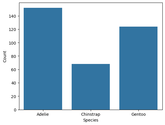
You can use the Pandas .value_counts method to make a table:
penguins["species"].value_counts()
species
Adelie       152
Gentoo       124
Chinstrap     68
Name: count, dtype: int64
To make the bar plot, first import Seaborn. The conventional abbreviation for
the package is sns:
import seaborn as sns
Seaborn provides two different functions for making bar plots:
The
sns.barplotfunction requires two features: the category for each bar and the length of each bar. It’s best for data that’s already been grouped and aggregated. For example, you could compute the median flipper length of each penguin species and then plot the means withsns.barplot.The
sns.countplotfunction only requires one feature: a categorical array. The function automatically groups and aggregates the values by counting them. It’s best for visualizing the distribution of a categorical feature. Note that this is purely a convenience function—you could just compute the counts yourself and plot them withsns.barplot.
Use the sns.countplot function to make a bar plot of the distribution of
penguin species:
sns.countplot(penguins, x = "species")
<Axes: xlabel='species', ylabel='count'>

The function returns a Matplotlib Axes. You can use this to customize the plot. For example, to capitalize the axis labels:
ax = sns.countplot(penguins, x = "species")
ax.set_xlabel("Species")
ax.set_ylabel("Count")
Text(0, 0.5, 'Count')
Most Seaborn plotting functions also have an ax parameter you can use to
specify an Axes on which to plot. This makes it possible to add to existing
Axes and to customize plots produced by plotting functions that don’t return an
Axes object. Using this approach, the equivalent of the previous example is:
fig, ax = plt.subplots()
sns.countplot(penguins, x = "species", ax = ax)
ax.set_xlabel("Species")
ax.set_ylabel("Count")
Text(0, 0.5, 'Count')
Besides species, the Palmer Penguins data set also includes information about
the island where each bird was observed and the biological sex of each bird.
When a data set has multiple categorical features, it’s important to check how
the observations are grouped within them, since unbalanced groups can bias
analyses. You can use color to represent a second categorical feature in a bar
plot. Seaborn uses the hue parameter to link color to a feature. So to make
the bar plot show both species and sex:
fig, ax = plt.subplots()
sns.countplot(penguins, x = "species", hue = "sex", ax = ax)
ax.set_xlabel("Species")
ax.set_ylabel("Count")
Text(0, 0.5, 'Count')
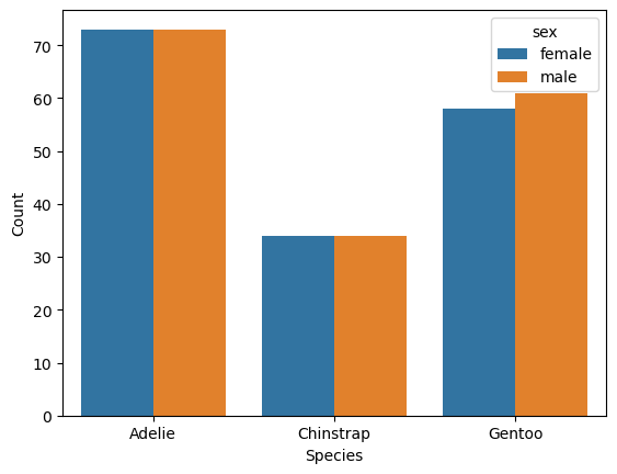
The plot suggests the sexes are relatively well-balanced across the observed penguins, regardless of species. Of course, there’s still the island feature to consider.
A bar plot can really only summarize two features at once, and many other types of plots are also limited to just two or three features. One way to represent more categorical features is to use facets, side-by-side plots that each show data for a mutually exclusive category or combination of categories.
Most plotting packages provide convenience functions for making faceted plots,
and Seaborn is no exception. The sns.FacetGrid function creates
a grid of plots based on one or two categorical features. You can use the
returned FacetGrid’s .map_dataframe method to call a plotting function for
each facet with the appropriate subsets of the data. For example, to indicate
sex by row, island by column, and use a separate bar for each species:
grid = sns.FacetGrid(penguins, row = "sex", col = "island")
grid.map_dataframe(sns.countplot, x = "species")
<seaborn.axisgrid.FacetGrid at 0x72d523e5c050>
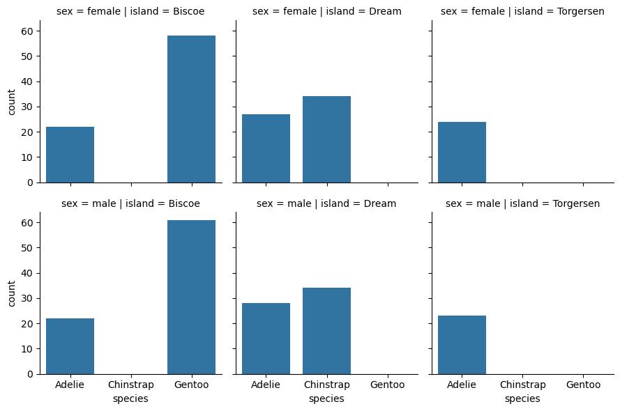
The margin_titles parameter of sns.FacetGrid controls whether the group
titles are placed in the margins. The default is False, but setting the
parameter to True makes the plot easier to read:
grid = sns.FacetGrid(
    penguins, row = "sex", col = "island", margin_titles = True)
grid.map_dataframe(sns.countplot, x = "species")
<seaborn.axisgrid.FacetGrid at 0x72d52384fed0>

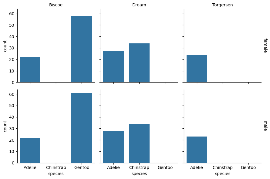
You can use the FacetGrid method .set_titles to set the titles of faceted
plots. The title strings are treated as templates with some values replaced
automatically. For instance, {row_name} is replaced by the row’s category.
Here’s how to change the titles so that they only show the categories and not
the feature names:
grid = sns.FacetGrid(
    penguins, row = "sex", col = "island", margin_titles = True)
grid.map_dataframe(sns.countplot, x = "species")
grid.set_titles(row_template = "{row_name}", col_template = "{col_name}")
<seaborn.axisgrid.FacetGrid at 0x72d523093d90>
Tip
If you want to change the names of the categories in a feature, do that as a separate step before making visualizations. The Pandas documentation about Categorical data provides details about how to create categorical features and set category names.
Similarly, you can use the .set_axis_labels to set the axis labels:
grid = sns.FacetGrid(
    penguins, row = "sex", col = "island", margin_titles = True)
grid.map_dataframe(sns.countplot, x = "species")
grid.set_titles(row_template = "{row_name}", col_template = "{col_name}")
grid.set_axis_labels(x_var = "Species", y_var = "Count")
<seaborn.axisgrid.FacetGrid at 0x72d545038050>

Seaborn’s methods for creating and customizing faceted plots are convenient,
and you can read more about them in the FacetGrid documentation.
Occasionally, you may need to work with the underlying Matplotlib Figure and
Axes. Fortunately, FacetGrid objects provide access to these through the
.figure and .axes attributes.
Note
This case study focuses on categorical features and the next focuses on continuous features. So what should you do if you have a discrete feature?
Discrete features share properties of categorical features (both are enumerable) and properties of continuous features (both are quantitative). This usually means you can choose whether to treat discrete features as categorical or continuous. Categorical methods tend to be more appropriate for discrete features that take relatively few distinct values, and continuous methods tend to be more appropriate for ones that don’t.
5.4.2. Plotting a Continuous Distribution#
Note
This case study shows how to:
Use Seaborn to plot the distribution of one or more continuous features
Section 5.4.1 shows how to visualize the distribution of a categorical feature. For this case study, let’s examine one of the continuous features in the Palmer Penguins data set from Section 5.2.1.
There are many different ways to visualize continuous features, such as histograms, density plots, box plots, violin plots, and empirical cumulative distribution function plots. The Seaborn documentation provides a detailed guide to visualizing distributions.
Warning
The sns.displot function can create many different kinds of distribution
plots, but it operates at the Figure level and does not accept or return an
Axes, making it difficult to customize the result. For this reason, we
recommend against using sns.displot.
If you decide to use sns.displot anyways, be careful not to confuse it with
sns.distplot (with two “t”s). Both make distribution plots, but the former
uses a new interface that’s more consistent with other Seaborn functions. You
should use the new interface (sns.displot) in any new code you write, as
support for the old interface may eventually end.
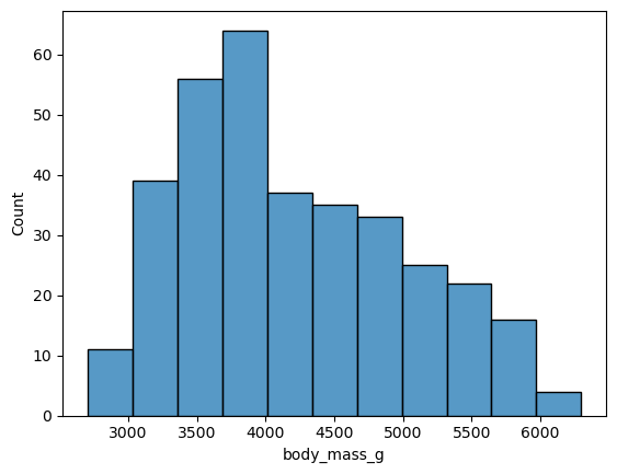
Let’s visualize the distribution of the birds’ body mass, which is recorded in
the body_mass_g feature. Some of Seaborn’s functions for plotting continuous
distributions are:
sns.histplotto make a histogramsns.kdeplotto make a density (or “kernel density estimator”) plotsns.boxplotto make a box plotsns.boxenplotto make a boxen (or “letter value”) plotsns.ecdfplotto make an empirical cumulative distribution function plotsns.violinplotto make a violin plot
For example, to make a histogram:
sns.histplot(penguins, x = "body_mass_g")
<Axes: xlabel='body_mass_g', ylabel='Count'>
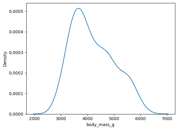
And to make a density plot:
sns.kdeplot(penguins, x = "body_mass_g")
<Axes: xlabel='body_mass_g', ylabel='Density'>
Like most other Seaborn plotting functions, these functions have an ax
parameter for the Axes on which to plot, and also returns an Axes. So to make
the x-axis label easier to read:
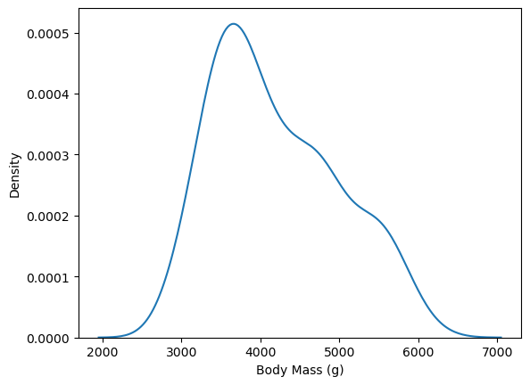
fig, ax = plt.subplots()
sns.kdeplot(penguins, x = "body_mass_g", ax = ax)
ax.set_xlabel("Body Mass (g)")
Text(0.5, 0, 'Body Mass (g)')
Density plots are convenient when you want to break down the distribution of a continuous feature across the categories of a categorical feature, because the plot can show a separate line for each category. For instance, to group body mass by species:
fig, ax = plt.subplots()
sns.kdeplot(penguins, x = "body_mass_g", hue = "species", ax = ax)
ax.set_xlabel("Body Mass (g)")
Text(0.5, 0, 'Body Mass (g)')
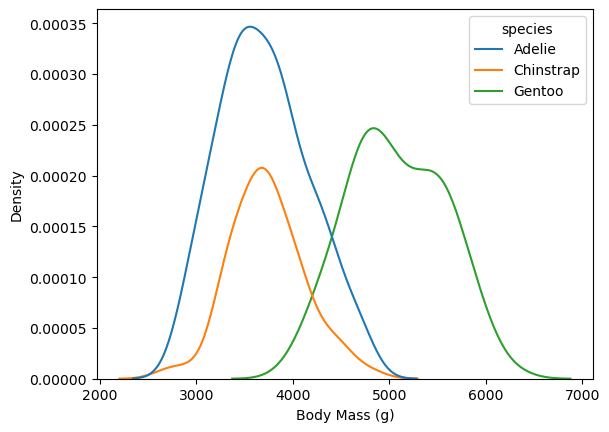
This makes it easy to see that Gentoo penguins typically have more mass than the other two species.
As in Section 5.4.1, you can incorporate more categorical features by faceting. To incorporate another continuous feature, it’s necessary to change plot types.
You can visualize the distributions of and relationship between two continuous
features with a scatter plot (sns.scatterplot) or a smoothed scatter plot
(again sns.kdeplot). The latter smooths out the points in a scatter plot to
show their relative density, using a 2-dimensional generalization of the method
used to estimate a density plot. For instance, to plot body weight against
flipper length:
fig, ax = plt.subplots()
sns.kdeplot(
    penguins, x = "body_mass_g", y = "flipper_length_mm", hue = "species",
    ax = ax)
ax.set_xlabel("Body Mass (g)")
ax.set_ylabel("Flipper Length (mm)")
Text(0, 0.5, 'Flipper Length (mm)')
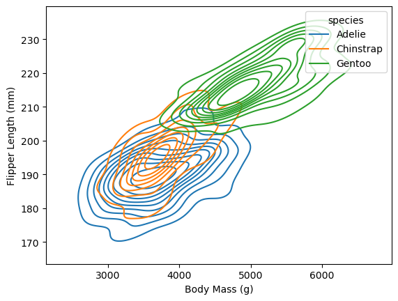
In this plot it’s possible to see how the distributions of body mass and flipper length differ across species, as well as how body mass and flipper mass are related.
Tip
Visualizing more than two continuous features at once can be challenging. One way to get around this problem is to create a separate plot for each pair of features.
If it really is necessary to visualize more than two at once, consider converting at least one of them into a categorical feature by binning or discretizing the values. Then you can use strategies for categorical features such as varying colors and faceting.
5.4.3. Plotting a Time Series#
Note
This case study shows how to:
Convert temporal data to appropriate data types
Use Seaborn to plot a time series as a histogram or a line
Use multiple data sets in a single plot
Customize and rotate the text of tick labels
Move a legend on a Seaborn plot
Plotting a time series can be tricky because you first need to make sure that the temporal features have appropriate data types. For this case study, suppose you want to make a visualization that shows the relationship between flu rates in birds and humans.
People mail dead birds to the USDA and USGS, where scientists analyze the birds to find out why they died. The USDA compiles the information into a public Avian Influenza data set each year.
Important
You can download the Avian Influenza data HERE.
You can use pandas’ pd.read_csv function to read the data. Each row
corresponds to one bird death. There are 8 columns with information about the
date, species of bird, collection method, and location. The Date Detected
column is a date, while the rest of the columns are categorical, which you can
see by taking a peek at the data set:
import pandas as pd

pd.read_csv("data/hpai-wild-birds-ver2.csv", nrows = 5)
| State | County | Date Detected | HPAI Strain | Bird Species | WOAH Classification | Sampling Method | Submitting Agency | |
|---|---|---|---|---|---|---|---|---|
| 0 | South Carolina | Colleton | 1/13/2022 | EA H5N1 | American wigeon | Wild bird | Hunter harvest | NWDP |
| 1 | South Carolina | Colleton | 1/13/2022 | EA H5N1 | Blue-winged teal | Wild bird | Hunter harvest | NWDP |
| 2 | North Carolina | Hyde | 1/12/2022 | EA H5N1 | Northern shoveler | Wild bird | Hunter harvest | NWDP |
| 3 | North Carolina | Hyde | 1/20/2022 | EA H5N1 | American wigeon | Wild bird | Hunter harvest | NWDP |
| 4 | North Carolina | Hyde | 1/20/2022 | EA H5 | Gadwall | Wild bird | Hunter harvest | NWDP |
To parse the dates, set the pd.read_csv function’s parse_dates parameter to
a list of date columns to parse. You can also set the dtype parameter to data
types for other columns, either as a dictionary with one entry per column, or a
string default type. So to read the date column as dates and the rest as
categories:
birds = pd.read_csv(
    "data/hpai-wild-birds-ver2.csv",
    parse_dates = ["Date Detected"], dtype = "category")

birds.info()
<class 'pandas.core.frame.DataFrame'>
RangeIndex: 6542 entries, 0 to 6541
Data columns (total 8 columns):
 #   Column               Non-Null Count  Dtype
---  ------               --------------  -----
 0   State                6542 non-null   category
 1   County               6542 non-null   category
 2   Date Detected        6540 non-null   datetime64[ns]
 3   HPAI Strain          6541 non-null   category
 4   Bird Species         6542 non-null   category
 5   WOAH Classification  6542 non-null   category
 6   Sampling Method      6542 non-null   category
 7   Submitting Agency    6542 non-null   category
dtypes: category(7), datetime64[ns](1)
memory usage: 144.6 KB
Tip
It’s also possible to parse dates in pandas with the pd.to_datetime function,
and to convert columns to other data types with the .astype method.
Specifying appropriate data types when you read data often provides performance benefits, but doing data type conversions later gives you more flexibility to clean the data first. So which approach you should use in any given situation depends on the data set and your analysis goals.
What kind of plot is appropriate for this data set? Note that there are several dates where more than one bird was collected:
birds["Date Detected"].value_counts().head()
Date Detected
2022-10-25    366
2022-11-21    148
2022-09-13    129
2022-09-23    128
2022-02-16    109
Name: count, dtype: int64
While you could use a line plot to show the counts for each date, there are
also many dates where the counts are zero. To see a smoothed out version of the
line plot, you can use a histogram of the observations. In Seaborn, the
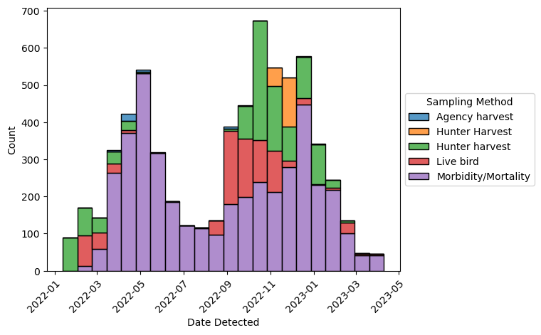
sns.histplot function makes a histogram (and returns a Matplotlib Axes):
import seaborn as sns
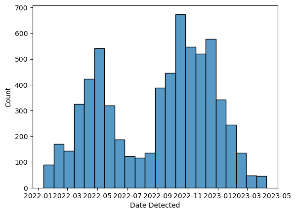
ax = sns.histplot(birds, x = "Date Detected")
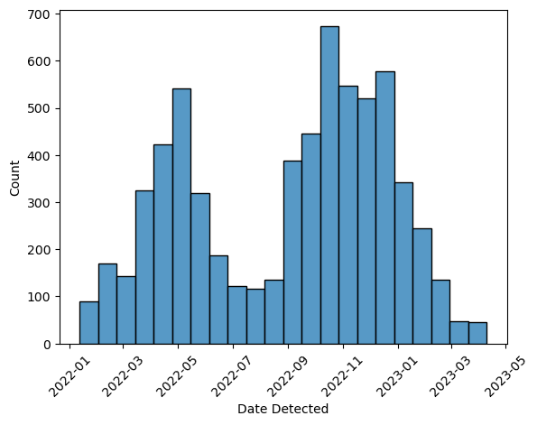
Depending on how wide your screen is, the x-axis tick labels may get squeezed
together, making them difficult to read. This problem is especially common when
plotting dates, since the labels tend to be long. One way to fix it is to
rotate the labels. With Matplotlib, you can use the Axes method .set_xticks
(or .set_yticks) to control properties of the ticks and tick labels. The
first two arguments to the function are the tick positions and tick labels; you
can get the default values with the .get_xticks and .get_xticklabels
methods. The rotation parameter controls the degree of rotation. So to make
the histogram with the x-axis tick labels at 45 degrees:
ax = sns.histplot(birds, x = "Date Detected")
ax.set_xticks(ax.get_xticks(), ax.get_xticklabels(), rotation = 45)
[<matplotlib.axis.XTick at 0x72d5229ef110>,
 <matplotlib.axis.XTick at 0x72d522723390>,
 <matplotlib.axis.XTick at 0x72d522723b10>,
 <matplotlib.axis.XTick at 0x72d52276c2d0>,
 <matplotlib.axis.XTick at 0x72d52276ca50>,
 <matplotlib.axis.XTick at 0x72d52276d1d0>,
 <matplotlib.axis.XTick at 0x72d52276d950>,
 <matplotlib.axis.XTick at 0x72d52276e0d0>,
 <matplotlib.axis.XTick at 0x72d52276e850>]
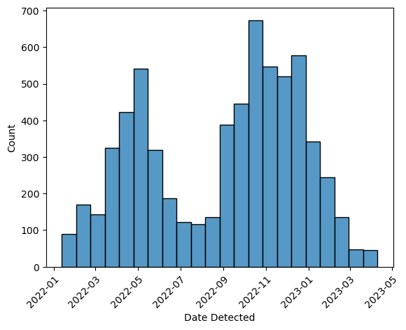
The rotation interferes with the horizontal alignment of the tick labels, so
they’re positioned too far to the right. To fix this, set the horizontal
alignment parameter ha to "right" and set the rotation mode parameter
rotation_mode to "anchor":
ax = sns.histplot(birds, x = "Date Detected")
ax.set_xticks(
    ax.get_xticks(), ax.get_xticklabels(), rotation = 45, ha = "right",
    rotation_mode = "anchor")
[<matplotlib.axis.XTick at 0x72d5227939d0>,
 <matplotlib.axis.XTick at 0x72d5227cf890>,
 <matplotlib.axis.XTick at 0x72d52261c050>,
 <matplotlib.axis.XTick at 0x72d52261c7d0>,
 <matplotlib.axis.XTick at 0x72d52261cf50>,
 <matplotlib.axis.XTick at 0x72d52261d6d0>,
 <matplotlib.axis.XTick at 0x72d52261de50>,
 <matplotlib.axis.XTick at 0x72d52261e5d0>,
 <matplotlib.axis.XTick at 0x72d52261ed50>]
The data set includes information about how the birds were collected in the
Sampling Method column. You can incorporate this information in the plot by
setting the hue parameter in the call to sns.histplot. In this case,
stacked bars are a good choice since the focus is on the total counts for each
date range rather than the individual sampling methods. You can make the bars
stack by setting the multiple parameter to "stack". The code becomes:
ax = sns.histplot(
    birds, x = "Date Detected", hue = "Sampling Method", multiple = "stack")
ax.set_xticks(
    ax.get_xticks(), ax.get_xticklabels(), rotation = 45, ha = "right",
    rotation_mode = "anchor")
[<matplotlib.axis.XTick at 0x72d5226682d0>,
 <matplotlib.axis.XTick at 0x72d52253b250>,
 <matplotlib.axis.XTick at 0x72d52253b9d0>,
 <matplotlib.axis.XTick at 0x72d522588190>,
 <matplotlib.axis.XTick at 0x72d522588910>,
 <matplotlib.axis.XTick at 0x72d522589090>,
 <matplotlib.axis.XTick at 0x72d522589810>,
 <matplotlib.axis.XTick at 0x72d522589f90>,
 <matplotlib.axis.XTick at 0x72d52258a710>]
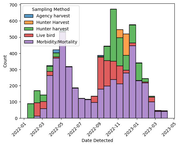
Seaborn automatically creates a legend, but the placement on top of the plot
isn’t ideal. While you could create the legend manually with Matplotlib
instead, in this case it’s easier to use Seaborn’s sns.move_legend
function to move the legend:
ax = sns.histplot(
    birds, x = "Date Detected", hue = "Sampling Method", multiple = "stack")
ax.set_xticks(
    ax.get_xticks(), ax.get_xticklabels(), rotation = 45, ha = "right",
    rotation_mode = "anchor")
sns.move_legend(ax, loc = "center left", bbox_to_anchor = (1, 0.5))
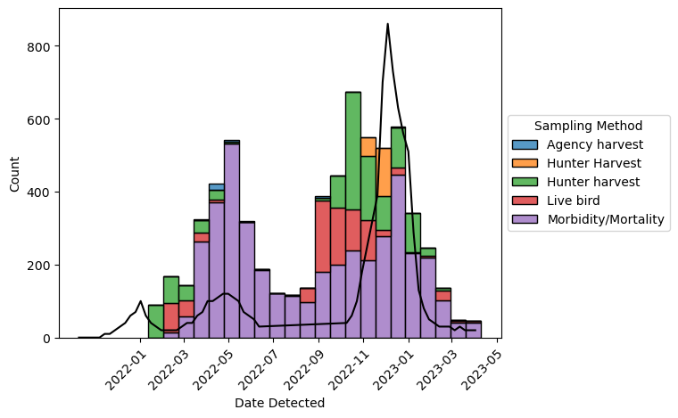
The plot looks good, so now let’s add data about human flu rates. The CDC collects data about flu hospitalizations across 13 states. The data is publicly available as the FluServ-NET data set.
Important
You can download the FluServ-NET data HERE.
In the FluServ-NET data set, each row corresponds to a single combination of week, year, age, sex, and race. There are 10 columns, which are a mix of data types. The CSV file the CDC provides contains extra text at the beginning and end, and the column names contain spaces and other problematic characters. You can read and clean up the data set with this code:
flu = pd.read_csv(
    "data/FluSurveillance_Custom_Download_Data.csv", skiprows = 2)
flu.head()
| CATCHMENT | NETWORK | YEAR | MMWR-YEAR | MMWR-WEEK | AGE CATEGORY | SEX CATEGORY | RACE CATEGORY | CUMULATIVE RATE | WEEKLY RATE | |
|---|---|---|---|---|---|---|---|---|---|---|
| 0 | Entire Network | FluSurv-NET | 2021-22 | 2021.0 | 40.0 | Overall | Overall | Overall | 0.0 | 0.0 |
| 1 | Entire Network | FluSurv-NET | 2021-22 | 2021.0 | 40.0 | Overall | Overall | White | 0.0 | 0.0 |
| 2 | Entire Network | FluSurv-NET | 2021-22 | 2021.0 | 40.0 | Overall | Overall | Black | 0.0 | 0.0 |
| 3 | Entire Network | FluSurv-NET | 2021-22 | 2021.0 | 40.0 | Overall | Overall | Hispanic/Latino | 0.0 | 0.0 |
| 4 | Entire Network | FluSurv-NET | 2021-22 | 2021.0 | 40.0 | Overall | Overall | Asian/Pacific Islander | 0.0 | 0.0 |
# Fix the column names.
flu.columns = flu.columns.str.lower().str.strip()
flu.columns = flu.columns.str.replace("[ -]+", "_", regex = True)

# Remove the text at the end.
flu = flu.query("catchment == 'Entire Network'")
For the plot, you’ll only need the "Overall" age, sex, and race categories:
flu = flu.query(
    "age_category == 'Overall' and sex_category == 'Overall' and "
    "race_category == 'Overall'")
You can convert each year and week pair into a date by concatenating them and
then parsing with the pd.to_datetime function:
dates = 1000 * flu["mmwr_year"] + 10 * flu["mmwr_week"]
dates = dates.astype(int).astype(str)
flu.loc[:, "date"] = pd.to_datetime(dates, format = "%Y%W%w")
Finally, you can add a line for the weekly flu rates in the weekly_rate
column with the .plot method. The weekly flu rates are measured in
hospitalizations per 100,000 people and typically range from 0 to 100.
Multiplying by 100 to convert to hospitalizations per 10 million people makes
the range 0 to 1000, which is a nice match for the y-axis already on the plot.
The code becomes:
ax = sns.histplot(
    birds, x = "Date Detected", hue = "Sampling Method", multiple = "stack")
ax.set_xticks(
    ax.get_xticks(), ax.get_xticklabels(), rotation = 45, ha = "right",
    rotation_mode = "anchor")
sns.move_legend(ax, loc = "center left", bbox_to_anchor = (1, 0.5))

ax.plot(flu["date"], flu["weekly_rate"] * 100, color = "#000000")
[<matplotlib.lines.Line2D at 0x72d5222e5e50>]
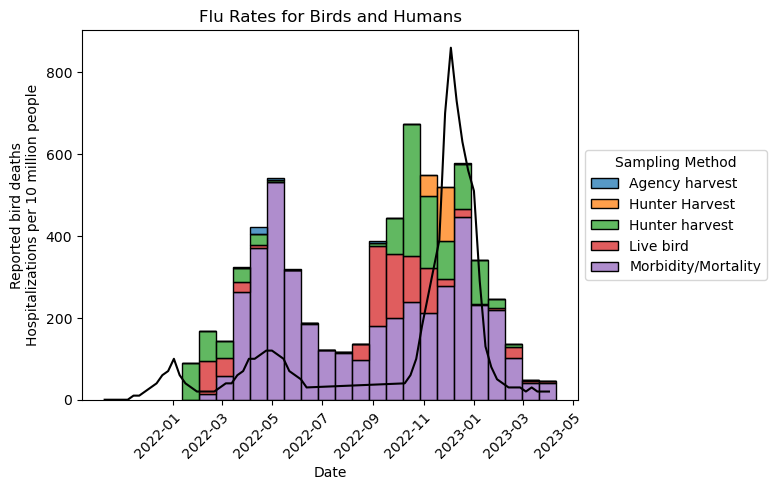
Finally, add a title and clarify what the y-axis means:
ax = sns.histplot(
    birds, x = "Date Detected", hue = "Sampling Method", multiple = "stack")
ax.set_xticks(
    ax.get_xticks(), ax.get_xticklabels(), rotation = 45, ha = "right",
    rotation_mode = "anchor")
sns.move_legend(ax, loc = "center left", bbox_to_anchor = (1, 0.5))

ax.plot(flu["date"], flu["weekly_rate"] * 100, color = "#000000")

ax.set_title("Flu Rates for Birds and Humans")
ax.set_xlabel("Date")
ax.set_ylabel("Reported bird deaths\nHospitalizations per 10 million people")
Text(0, 0.5, 'Reported bird deaths\nHospitalizations per 10 million people')
5.4.4. Plotting a Function#
Note
This case study shows how to:
Plot a function
Fill the area under a function
Set custom colors for lines, fills, and annotations
Hide the axes of a plot
Add annotations to a plot
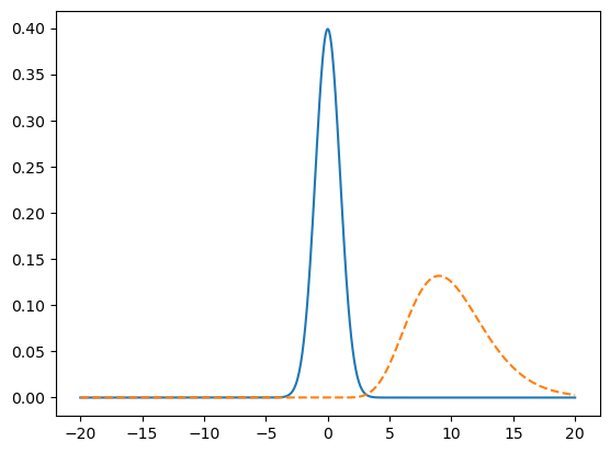
Plotting a curve or function can make it much easier to understand and explain
its behavior. For this case study, suppose you want to make a visualization
that shows how the area of overlap between two different probability density
functions is a measure of how similar they are. They should have some overlap,
but not too much. The color palette should be UC blue (#1a3f68) and gold
(#e6c257) to match the rest of your presentation.
Note
A probability density function is a function that shows how likely different outcomes are for a continuous probability distribution. The probability of outcomes in any given interval is the area under the curve. For example, if the area under the curve between 0 and 1 is 0.2, then there’s a 20% chance of an outcome between 0 and 1. The total area under the curve is always 1.
Since the total area under a probability density function is always 1, the area of overlap between two density functions is always between 0 and 1. As a result, the area of overlap is a convenient measure of similarity.
To plot a function, first evaluate it at many points over the interval of
interest. Let’s start with 1,000 points in the interval \((-20, 20)\). You can
use NumPy’s np.linspace function to compute evenly spaced points:
import numpy as np

x = np.linspace(-20, 20, 1000)
The SciPy package provides probability density functions for common
distributions. Let’s use a normal distribution and a gamma distribution. Normal
distributions are widely known, while gamma distributions are visually
different but will still have some overlap. You can import the probability
density functions for these distributions from scipy.stats. The gamma
distribution requires a shape parameter; let’s use 10. Evaluate functions the
at the x-coordinates:
from scipy.stats import norm, gamma

y1 = norm.pdf(x)
y2 = gamma.pdf(x, 10)
You can use Matplotlib to plot the \((x, y)\) coordinates as lines. The .plot
method creates a line plot by default. Set the linestyle parameter on one of
the lines to a dash (--) so that the lines are distinct:
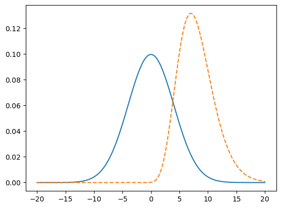
fig, ax = plt.subplots()
ax.plot(x, y1)
ax.plot(x, y2, linestyle = "--")
[<matplotlib.lines.Line2D at 0x72d5220a1bd0>]
The two distributions don’t overlap much, but you can fix that by adjusting
their parameters. SciPy provides location (loc) and scale (scale)
parameters to control where distributions are located and how much they spread
out. The defaults are 0 and 1, respectively. To get some overlap, let’s
increase the scale of the normal distribution to 4 and shift the location of
the gamma distribution over to -2. Then the code for the plot becomes:
x = np.linspace(-20, 20, 1000)
y1 = norm.pdf(x, scale = 4)
y2 = gamma.pdf(x, 10, loc = -2)

fig, ax = plt.subplots()
ax.plot(x, y1)
ax.plot(x, y2, linestyle = "--")
[<matplotlib.lines.Line2D at 0x72d521f2e850>]
Let’s emphasize the overlap by filling it with a color. Axes have a
.fill_between method that fills the area underneath a curve. In this case,
the area of overlap is the area underneath whichever function happens to be
smaller at a given point—the minimum of the two functions. NumPy’s np.fmin
function computes the element-wise minimum of two arrays. So the code becomes:
x = np.linspace(-20, 20, 1000)
y1 = norm.pdf(x, scale = 4)
y2 = gamma.pdf(x, 10, loc = -2)

fig, ax = plt.subplots()
ax.plot(x, y1)
ax.plot(x, y2, linestyle = "--")

# Fill area of overlap.
ymin = np.fmin(y1, y2)
ax.fill_between(x, ymin)
<matplotlib.collections.FillBetweenPolyCollection at 0x72d523e5de80>
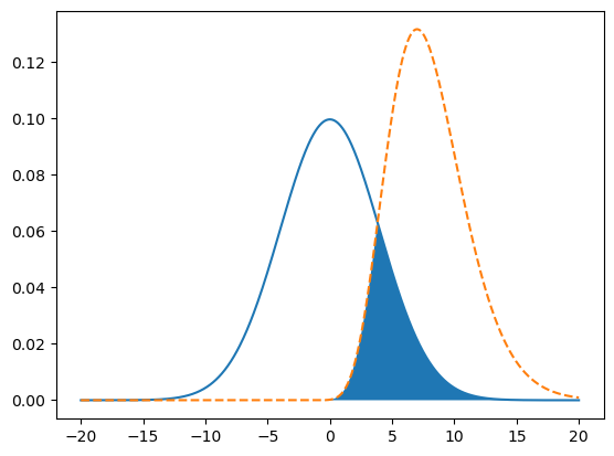
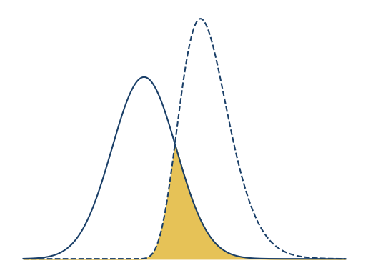
This diagram is meant to make it easier to explain area of overlap, which is
shown by the curves and fill. The axis ticks and labels don’t aid
understanding, so let’s remove them. You can use the Axes .axis method with
the argument "off" to do so. Let’s adjust the x interval to \((-15, 25)\) to
center the curves, change the color to UC blue for the lines, and change the
color to UC gold for the fill:
x = np.linspace(-15, 25, 1000)
y1 = norm.pdf(x, scale = 4)
y2 = gamma.pdf(x, 10, loc = -2)

fig, ax = plt.subplots()
ax.plot(x, y1, color = "#1a3f68")
ax.plot(x, y2, color = "#1a3f68", linestyle = "--")

# Fill area of overlap.
ymin = np.fmin(y1, y2)
ax.fill_between(x, ymin, color = "#e6c257")

ax.axis("off")
(np.float64(-17.0),
 np.float64(27.0),
 np.float64(-0.006587663025137597),
 np.float64(0.13834092352788954))
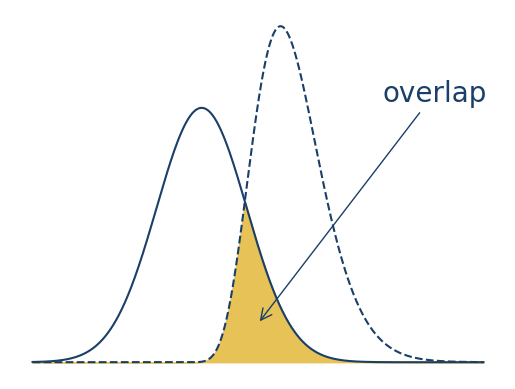
Finally, let’s add a text label and arrow to emphasize the area of overlap. You
can use the .annotate method to add an annotation to an Axes.
Annotations are flexible: they can be lines, arrows, text, images, or some
combination of these.
For making a text label and arrow with .annotate, the following parameters
are important:
text: the text of the label, as a stringxy: the coordinates of the arrow’s tip, as a tuplexytext: the coordinates of the text and the arrow’s tail, as a tuplexycoords: a string that specifies the coordinate system; for example, the default"data"uses the data’s coordinate system, while"axes fraction"uses 0 to 1 along each axis, so \((0.5, 0.5)\) is the center; see the documentation for all possible optionscolor: the color of the text (but not the arrow), as a stringarrowprops: a dictionary with properties for the arrow, such as:arrowstyle: a string that specifies the arrow’s head and line stylecolor: the color of the arrow, as a string
fontsize: the point size of the text, as an integer
With the annotation, the plot becomes:
x = np.linspace(-15, 25, 1000)
y1 = norm.pdf(x, scale = 4)
y2 = gamma.pdf(x, 10, loc = -2)

fig, ax = plt.subplots()
ax.plot(x, y1, color = "#1a3f68")
ax.plot(x, y2, color = "#1a3f68", linestyle = "--")

# Fill area of overlap.
ymin = np.fmin(y1, y2)
ax.fill_between(x, ymin, color = "#e6c257")

ax.axis("off")

ax.annotate(
    text = "overlap", color = "#1a3f68", fontsize = 20,
    xy = (0.5, 0.15), xytext = (0.75, 0.75), xycoords = "axes fraction",
    arrowprops = {"color": "#1a3f68", "arrowstyle": "->"})
Text(0.75, 0.75, 'overlap')
5.4.5. Plotting an Image#
Note
This case study shows how to:
Plot an image
Plot other shapes on top of an image, such as rectangles
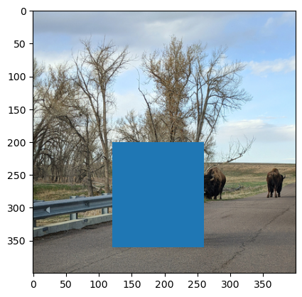
Image data sets are common in many disciplines. For example, a radiologist might have a collection of x-ray images. For these data sets, being able to display and annotate images is extremely helpful. In this case study, suppose you want to display the picture of American Bison in Fig. 5.4 and add a box around each animal.
Important
You can download the American Bison image by right-clicking on the image in
Fig. 5.4 and selecting Save Image As... from the context menu.
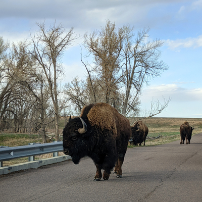
Fig. 5.4 American Bison#
The first step is to read the image into Python. The Pillow package
provides functions for reading, editing, and writing images. The package is a
fork (an alternative version) of the older Python Imaging Library (PIL), and
still uses the PIL name in Python code. Import the Image class from the
package:
from PIL import Image
You can use the Image method .open to read the image:
img = Image.open("data/bison.png")
Note
In computing contexts, an image is typically represented by an array of color values. Grayscale images can be represented by a 2-dimensional matrix, but color images require an extra dimension for the red, green, and blue channels.
The .imshow method expects an image with dimensions:
The channel dimension should have 3 elements: red, green, and blue, in that
order. The .imshow method also works with grayscale images that only have 2
dimensions.
If you try to plot an image with .imshow and Python raises an error or the
image looks strange (especially the colors), the first thing to check is
whether the image has the right dimensions and color channels. You can usually
fix any problems with the functions NumPy and Pillow provide to reshape arrays
and convert between different color spaces.
The Axes method .imshow plots an image. As usual, use plt.subplots to set
up a Figure and Axes before plotting:
fig, ax = plt.subplots()
ax.imshow(img)
<matplotlib.image.AxesImage at 0x72d523e5e3c0>

Now let’s add a red rectangle around the bison in the foreground. In Matplotlib
terminology, a 2-dimensional geometric shape is a Patch, and a Rectangle
is a specific kind of Patch. To create a rectangle, import matplotlib and use
the patches.Rectangle constructor function. The function’s first argument is
a tuple with the top left coordinates of the rectangle. You can use separate
arguments to specify the width and height. For the bison image, position the
rectangle at (120, 200), make the width 140, and make the height 160:
import matplotlib as mpl

rect = mpl.patches.Rectangle((120, 200), width = 140, height = 160)
To add a Patch to a plot, use the Axes method .add_patch:
fig, ax = plt.subplots()
ax.imshow(img)
# Add rectangle.
ax.add_patch(rect)
<matplotlib.patches.Rectangle at 0x72d521d11bd0>
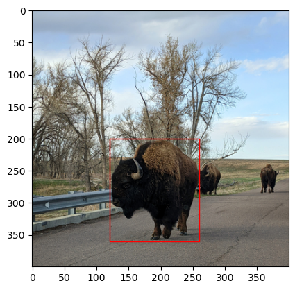
By default, patches are filled in blue, but you can change the fill and edge
colors by setting the facecolor and edgecolor arguments when you create the
Patch. The special color "none" is fully transparent. So to make the
rectangle have transparent fill and red edges:
rect = mpl.patches.Rectangle(
    (120, 200), width = 140, height = 160, facecolor = "none",
    edgecolor = "#FF0000")

fig, ax = plt.subplots()
ax.imshow(img)
# Add rectangle.
ax.add_patch(rect)
<matplotlib.patches.Rectangle at 0x72d521da1950>
You can create and add as many patches as needed to a plot. If you need to add lots of patches, consider whether it’s possible to use a loop. Image annotations are especially useful for displaying results from image processing and machine learning algorithms.
5.4.6. Plotting a Map#
Geospatial data are often best visualized by making a map. When you make a map, visualization best practices still apply, but there are also many additional details to consider, such as what projection to use. The GeoPandas package provides functions to read and visualize geospatial data. Like many other packages, the GeoPandas visualization functions are built on Matplotlib, so you can use the customization strategies described in this reader. No case study is provided here because working with geospatial data requires specialized knowledge that goes beyond the focus of this chapter.
Note
If you work with geospatial data frequently or need to make publication-quality maps, it may be better to use dedicated geospatial software, such as QGIS. DataLab’s Intro to Desktop GIS with QGIS workshop provides an introduction.