A regression model is a way to express a relationship between some response and one or more predictor variables. It’s such a common method of analysis that it can occasionally be difficult to remember that there is anything else to do.
Nearly every day I am asked questions about regression models, and they often seem motivated by anxiety about assumptions and validity of an interpretation. I’m going to try to provide you with the tools to begin answering those questions yourself. With practice you’ll hopefully begin to develop the ability to reason about your models and how they work.
Anyway, you’ve probably heard of and tried regression. Now you’re here. Why? I don’t know. Hopefully this will help!
Data
The data for a linear model are typically in a tabular format (imagine a spreadsheet), where each row of data is called an observation and each column is called a feature. The column that is the outcome of the model is called the response. Each observation should include a value for every feature (there are some ways of handling missing data but that’s beyond our scope for this workshop).
Plot before you model!
Your computer will do whatever you tell it to do, even if it’s not a good idea. With this great power comes the responsibility to think, and to check your assumptions.
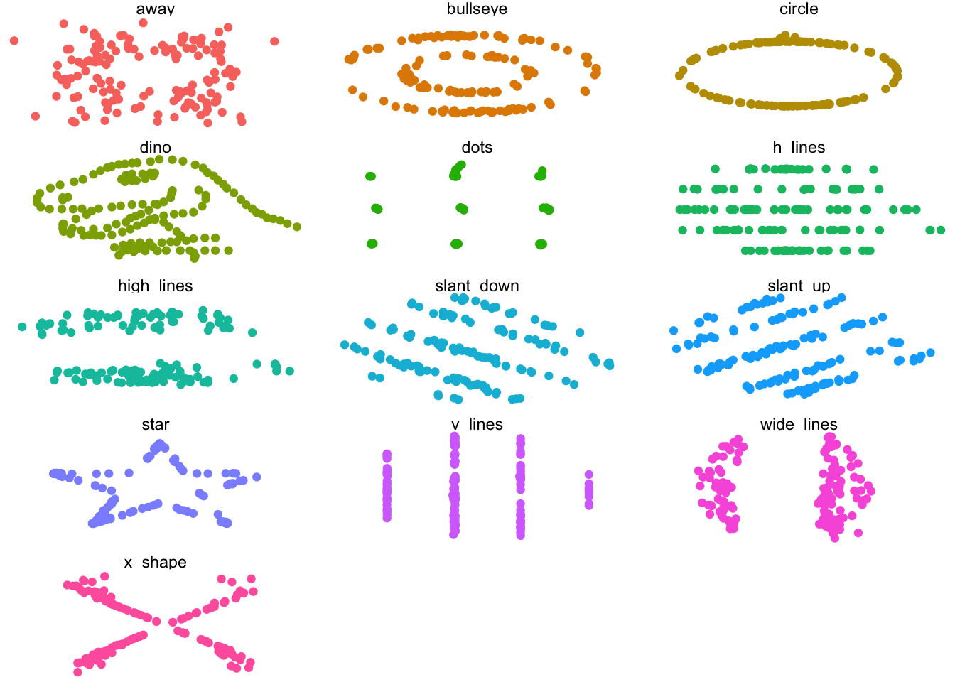
The first one to mention is the assumption that there is a relationship between the features and the response, of the type that the model describes. Your first, best way to test that assumption is to plot the data. Summaries like the means, variances, and correlations can only tell you so much. The following example points out why.
The Datasaurus Dozen are a collection of thirteen data sets. Each consists of two features (x and y) that have the same means, variances, and correlations.
# A tibble: 13 × 6
   dataset    correlation x_mean x_variance y_mean y_variance
   <chr>            <dbl>  <dbl>      <dbl>  <dbl>      <dbl>
 1 away            -0.064   54.3       281.   47.8       726.
 2 bullseye        -0.069   54.3       281.   47.8       726.
 3 circle          -0.068   54.3       281.   47.8       725.
 4 dino            -0.064   54.3       281.   47.8       726.
 5 dots            -0.06    54.3       281.   47.8       725.
 6 h_lines         -0.062   54.3       281.   47.8       726.
 7 high_lines      -0.069   54.3       281.   47.8       726.
 8 slant_down      -0.069   54.3       281.   47.8       726.
 9 slant_up        -0.069   54.3       281.   47.8       726.
10 star            -0.063   54.3       281.   47.8       725.
11 v_lines         -0.069   54.3       281.   47.8       726.
12 wide_lines      -0.067   54.3       281.   47.8       726.
13 x_shape         -0.066   54.3       281.   47.8       725.
You probably wouldn’t use a linear model for most of the panels of that plot because there isn’t a linear relationship between the feature (x-direction) and the response (y-direction). Plotting the data can also reveal problems or oddities in the data that will guide your further investigation.