3 Before You Viz, Make a Plan
Modern software makes it easy to quickly create a plot. But before you fire up your computer and start plotting, stop and think. Write out your visualization plan. This will save you time in the long run, and result in a more robust data visualization.
Ask yourself:
- Why am I making this visualization? (purpose)
- Who am I making it for? (audience)
- How will I use and share it? (medium)
- What can I use to make it? (tools)
- What story does it tell? (message)
- Who does it affect? Who is left out? (critical approach)
How many plots you need is always the wrong question. You need exactly as many as you need to tell your story.
3.1 Purpose
First, identify why you are making a visualization. We use data visualizations in different ways across the iterative steps of the research data pipeline:
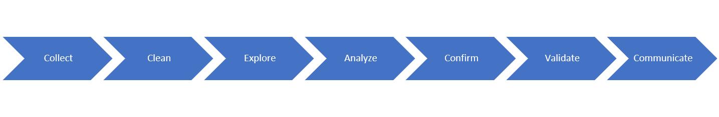
- Collection - plots can help us understand who, what, and where the data represent. It can help us track our progress, and help us project required effort to complete this phase of the project.
- Cleaning - plotting is a quick and effective way to spot errors in our data. It allows us to grasp the extent of issues such as outliers and missing data.
- Exploration - plots are a powerful tool for exploratory data analysis (EDA). Plots help us identify patterns, summarize variables and relationships. (see Tukey 1960)
- Confirmation - plots also help us conduct confirmatory data analysis (CDA). We can plot diagnostics like the model fit, residuals, and model comparisons that confirm whether a model is correct. CDA is an iterative process over the course of research, one reason why we advocate using scripting languages and other reproducible workflows for generating graphics.
- Validation - plots also help us to debug and validate our code. We can visually inspect the results at each step of the code we are writing and verify whether it satisfies our expectations.
- Communication - sharing the insights from our data with others is probably the most commonly understood and emphasized purpose of data visualizations. This is also often the hardest type of data visualization to “get right,” because we don’t always remember to design the visual to speak specifically to who we are sharing it with.
3.2 Audience
Who are you making the data visualization for? There is no such thing as a “generic” data visualization. Are you making the figure for yourself to help you clean or explore your data? For your immediate colleagues or research team to update them on your research progress? For experts in your field reading your publication or listening to your presentation? Is it for a general audience as part of your public outreach? What about policy makers who might not know all the details but might be making big decisions based on your results? Knowing who you’re making the visualization for will help you think through the following steps to create something of value for your intended purpose. It will also help you determine how effort is needed to compose a plot to achieve your goal.
3.3 Medium
There are always constraints when creating a data visualization. It’s best to discover these before you start, rather than after you’ve created a beautiful data visualization that’s completely inappropriate for your intended use. For example, if you are creating the visual to accompany a journal article, you probably need to use a static figure and not an interactive or dynamic dashboard. Does your journal allow for color figures? When in doubt, start with greyscale - it’s a lot easier to add color, rather than take it away, as you revise your figures. If you are showing the figure during a presentation, you probably want to simplify it - you audience will have 5 seconds max to read, understand, and interpret your visualization. A really complex figure that requires minutes to comprehend will just distract your audience away from what you - and your data - are saying. For a talk or presentation, it might be more effective to compose and display the same plot in different ways to best communicate your points. The opposite may be true for a poster presentation where your audience is expected to spend significant time pondering over your findings. In that case, you might want to have one very large, clear figure that disentangles the complexity of your project. If you’re creating a visual for a website, you might be able to go nuts - bring on the interactivity, the dynamic data display - until you crash the server because it requires too much compute time.
Checklist:
- static or dynamic/interactive?
- dashboard/apps?
- projector, paper, website?
- resolution?
- color?
3.4 Tools
At the UC Davis DataLab, we advocate for the use of open-source software and scripting languages for data-driven research projects, including for generating data visualizations. Using scripting languages makes it easy for you to reproduce your data visualizations. As you clean and update your data, you can re-create your visuals easily by re-running your code. You can also return to a figure later and know exactly what it represents and how you made it. You don’t have to worry about remembering which buttons you clicked, and in what order, like you would when using a GUI based software. Using free, open-source software also means that you can easily and freely share your data, code, and output with your collaborators, reducing the equity and reproducibility barriers posed by the use of proprietary software. Open-source software that’s great for plotting - like R - also has amazing user communities and resources to help you learn the code and create your ideal visualization.
But be practical with yourself: you probably aren’t going to learn ggplot overnight. If your conference talk is tomorrow, using familiar software like Excel for plotting can be fine, especially if you know some tricks to clean up and customize the appearance of your plots.
Here’s a non-exhaustive list of open source tools we recommend for data visualization:
3.5 Message
Research is storytelling with data. Every data visualization is an important piece of that story. It may help you confirm (or reject) a hypothesis, discover new correlations, or predict the likelihood of a future event. Creating statistical graphics is like writing a novel - you get to decide who and what will be featured in your data story. And, just like one page of a novel, your data visualization alone doesn’t tell the whole story. Every data visualization should contain the details required for explanation, and they require narratives.
Write out captions for each plot before you make it. What does the plot show? After creating the plot, go back and update the caption with the take home points for your viewer. How might others focus on a different message? If you can’t articulate what the plot is about then you probably should rethink what you are choosing to display and how you are showing it.
For some inspiration, check out Hans Rosling’s famous TED talk on socio-economic metrics across the “developing world” for an example of how data visualization can tell complex and impactful data stories.
3.6 Critical Approaches
Don’t skip this step. It’s last on this list but is the most important on your journey to making useful data visualizations. Data are information, and information is power. Use this power intentionally and mindfully throughout the process of creating and sharing your visualizations.
As you reflect on your answers to the planning prompts above, critically review the features of your data:
- What do the variables you’ve selected for your visualization mean? How are they defined? How did those definitions come to be? Why did you select them?
- Who will your data visualizations affect? What groups are left out? How does this affect the story your data tells? How might someone misrepresent or misunderstand your story? Bring back the bodies.
Conducting these connotative and denotative explorations of your data will not only result in a more robust visualization, but will make you a better researcher and support a more inclusive and equitable society. To learn more and practice these steps on some case studies, check out our Critical Approach to Data Visualization workshop and Data Feminism research and learning cluster.