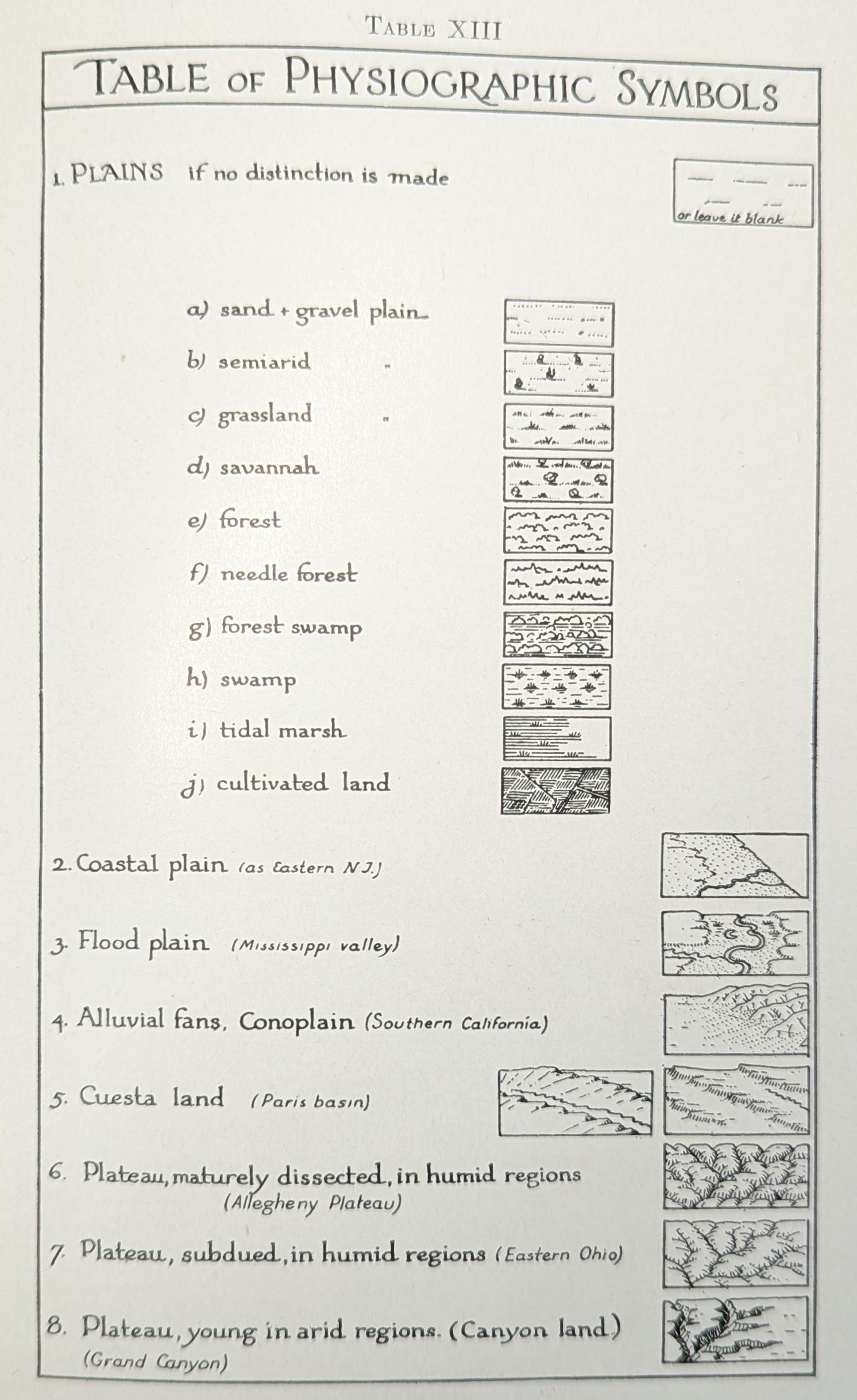
3 Icons
Before we start drawing our map, we need to plan how we will represent the items we include in our map and practice drawing them before we put them into the map.
Let’s make a list of the things we think we’ll need to draw in our map of Lake Spafford:
- Water
- Trees
- Bridges
- Pathways
- Roads
- Buildings
- Grass
- Field
On one of your sheets of paper, try drawing one or two versions of each of these things. Decide how much detail you need to include. Often simple is better for maps. Think about how these items look either from above or at an oblique angle, depending on the goal of your map. Maybe you want to mix nadir and oblique perspectives, depending on the item.
Use varied line weights to add emphasis or imply detail. Thick, heavy lines will draw attention to an object. Thin lines are helpful when drawing details that add to the feel of the icon but aren’t the main point.
![]()
Once you have pencil sketches, it’s a good idea to try inking the icons before you draw the map to see how the pen changes things. Then erase the pencil marks. This will give you an idea of how the eraser will interact with your pens. You might need to adjust your drawings to accommodate the finished product. Also, it’s better to find out you need to wait longer for your ink to dry before you erase on your trial page than on your finished map! Smeared ink is particularly disheartening when you’ve spent a lot of time on a map.
![]()
You’ll notice that I didn’t bother to ink the icon for grass that I really didn’t like. No need to spend time erasing, just move on.
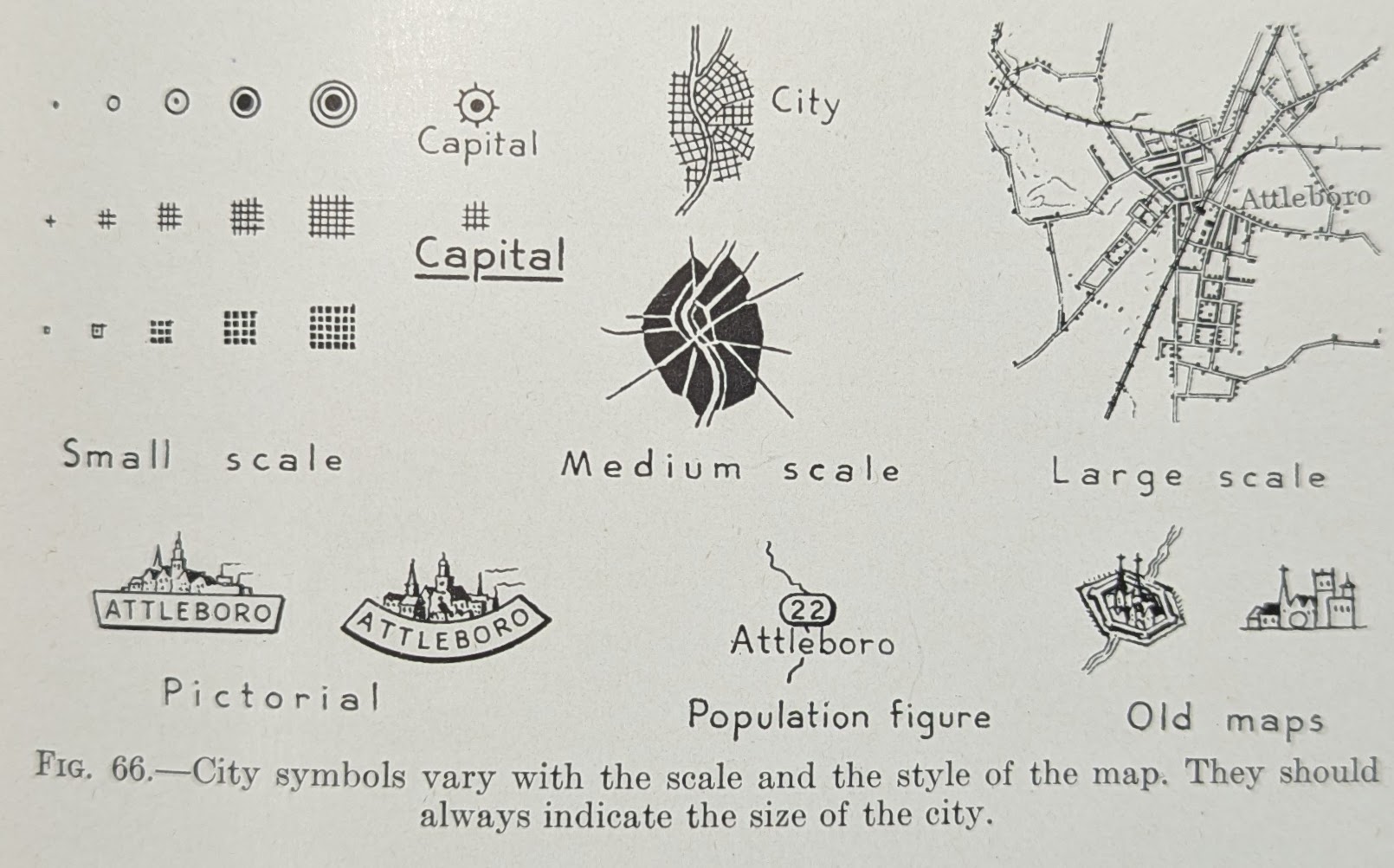
3.1 Looking for inspiration?
- The USGS Topographic Map Symbols are a good reference to get you started
- Sarah Bell’s tutorial for drawing hillshades by hand is a fantastic reference