5. Clustering and Classification#
This chapter directly extends the last. Chapter 4 showed you how to build a corpus from a collection of text files and product different metrics about them. For the most part these metrics hewed either toward the level of documents or that of words; we didn’t discuss ways of weaving these two aspects of our corpus together. In this chapter we’ll learn how to do so by identifying similar documents with a special measure, cosine similarity. With this measure, we’ll be able to cluster our corpus into distinct groups, which may in turn tell us something about its overall shape, trends, patterns, etc.
The applications of this technique are broad. Search engines use cosine similarity to identify relevant results to queries; literature scholars consult it to investigate authorship and topicality. Below, we’ll walk through the concepts that underlie cosine similarity and show a few examples of how to explore and interpret its results.
Learning Objectives
By the end of this chapter, you will be able to:
Rank documents by similarity, using cosine similarity
Project documents into a feature space to visualize their similarities
Cluster documents by their similarities
5.1. Preliminaries#
As before, we’ll first load some libraries.
import pandas as pd
from sklearn.metrics.pairwise import cosine_similarity
from sklearn.manifold import TSNE
from sklearn.cluster import AgglomerativeClustering
import matplotlib.pyplot as plt
import seaborn as sns
And we will load our data as well.
dtm = pd.read_csv("data/session_two/output/tfidf_scores.csv", index_col = 0)
5.2. The Vector Space Concept#
Measuring similarities requires a conceptual leap. Imagine projecting every document in our corpus into a space. In this space, similar documents have similar orientations to a point of origin (in this case, the origin point of XY axes), while dissimilar ones have different orientations. Guiding these orientations are the values for each term in a document. Here, space is a metaphor for semantics.
Here is a toy example to demonstrate this idea. Imagine two documents, each with a value for two terms.
toy = [[18, 7], [4, 12]]
toy = pd.DataFrame(toy, columns = ('page', 'screen'), index = ('d1', 'd2'))
toy
| page | screen | |
|---|---|---|
| d1 | 18 | 7 |
| d2 | 4 | 12 |
Since there are only two terms here, we can plot them using XY coordinates.
def quiver_plot(dtm, col1, col2):
    """Create a quiver plot from a DTM."""
    origin = [[0, 0], [0, 0]]
    fig, ax = plt.subplots(figsize = (8, 8))
    ax.quiver(*origin, dtm[col1], dtm[col2], scale = 1, units = 'xy')
    ax.set(
        xlim = (0, 20), ylim = (0, 20),
        xticks = range(0, 21), yticks = range(0, 21),
        xlabel = col1, ylabel = col2
    )
    for doc in toy.index:
        ax.text(
            dtm.loc[doc, col1], dtm.loc[doc, col2] + 0.5, doc,
            va = 'top', ha = 'center'
        )
    plt.show()

quiver_plot(toy, 'page', 'screen')
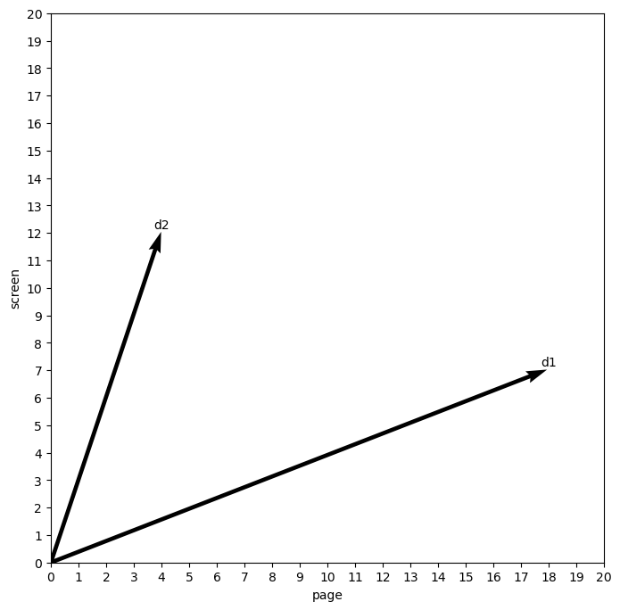
The important part of this plot is the angle created by the two documents. Right now, this angle is fairly wide, as the differences between the two counts in each document are rough inverses of one another.
But if we change the counts in our first document to be more like the second…
toy2 = [[10, 18], [4, 12]]
toy2 = pd.DataFrame(toy2, columns = ('page', 'screen'), index = ('d1', 'd2'))
toy2
| page | screen | |
|---|---|---|
| d1 | 10 | 18 |
| d2 | 4 | 12 |
And re-plot:
quiver_plot(toy2, 'page', 'screen')
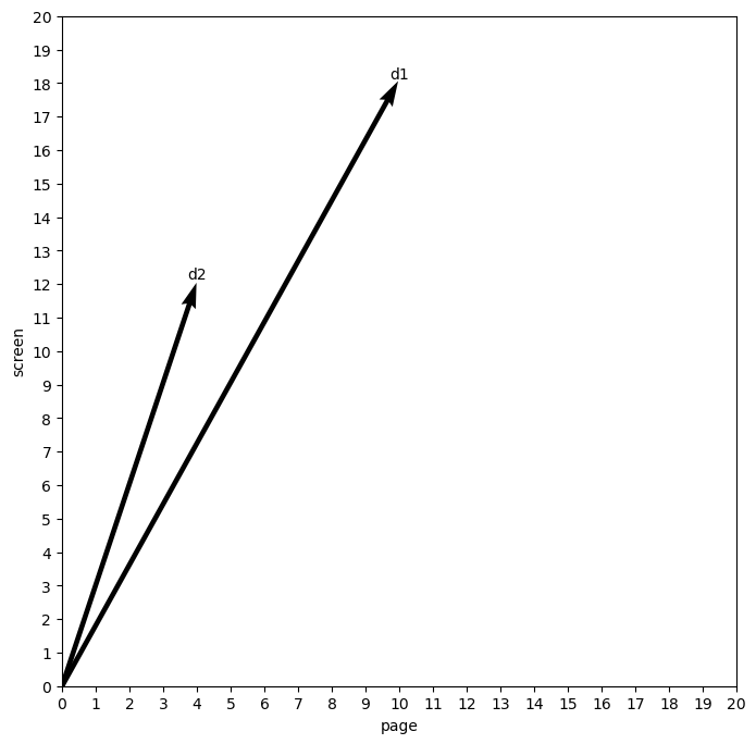
We will shrink the angle considerably. The first document is now more like the second. Importantly, this similarity is relatively impervious to the actual value of each word. The counts in each document are different, but the overall relationship between the values for each word is now similar: both documents have more instances of “screen” than “page,” and our method of projecting them into this space, or what we call a vector space, captures this.
5.3. Cosine Similarity#
Cosine similarity describes this difference in angles. This score measures the inner product space between two vectors, that is, the amount of space created by divergences in the attributes of each vector. Typically, the score is expressed within a bounded interval of [0, 1], where 0 stands for a right angle between two vectors (no similarity) and 1 measures vectors that completely overlap (total similarity).
Formally, cosine similarity is expressed
But we don’t need to worry about implementing this ourselves. scikit-learn
has a one-liner for this. It outputs a square matrix of values, where each cell
is the cosine similarity measure of the intersection between a column and a
row.
Here’s the first example:
cosine_similarity(toy)
array([[1.        , 0.63857247],
       [0.63857247, 1.        ]])
And here’s the second:
cosine_similarity(toy2)
array([[1.        , 0.98287219],
       [0.98287219, 1.        ]])
Of the two examples, which one has more similar documents? The second one: the cosine similarity score is 0.98, far higher than 0.64.
5.3.1. Generating scores#
For our purposes, the most powerful part of cosine similarity is that it takes into account many dimensions, not just two. That means we can send it our tf-idf scores, which have many dimensions:
print("Number of dimensions per text:", len(dtm.columns))
Number of dimensions per text: 31165
We’re working in very high-dimensional space! While this might be hard to
conceptualize (and indeed impossible to visualize), scikit-learn can do the
heavy lifting; we’ll just look at the results. Below, we use
cosine_similarity() to compute scores for comparisons across every document
combination in the corpus.
sims = cosine_similarity(dtm)
sims = pd.DataFrame(sims, columns = dtm.index, index = dtm.index)
sims.iloc[:5, :5]
/Users/tyler/.mambaforge/envs/nlp_workshop/lib/python3.11/site-packages/sklearn/utils/extmath.py:193: RuntimeWarning: invalid value encountered in matmul
  ret = a @ b
| name | Ada Lovelace | Robert E Lee | Andrew Johnson | Bedford Forrest | Lucretia Mott |
|---|---|---|---|---|---|
| name | |||||
| Ada Lovelace | 1.000000 | 0.019804 | 0.026482 | 0.019349 | 0.018810 |
| Robert E Lee | 0.019804 | 1.000000 | 0.141180 | 0.159599 | 0.028449 |
| Andrew Johnson | 0.026482 | 0.141180 | 1.000000 | 0.100110 | 0.058495 |
| Bedford Forrest | 0.019349 | 0.159599 | 0.100110 | 1.000000 | 0.018358 |
| Lucretia Mott | 0.018810 | 0.028449 | 0.058495 | 0.018358 | 1.000000 |
Now we’re able to identify the most and least similar texts to a given obituary. Below, we find most similar ones. When making a query, we need the second index position since the highest score will always be the obituary’s similarity to itself.
people = ('Ada Lovelace', 'Henrietta Lacks', 'FDR', 'Miles Davis')
for person in people:
    scores = sims.loc[person]
    most = scores.nlargest().take([1])
    print(f"For {person}: {most.index.item()} ({most.item():0.3f})")
For Ada Lovelace: Karen Sparck Jones (0.171)
For Henrietta Lacks: Ross G Harrison (0.119)
For FDR: Eleanor Roosevelt (0.507)
For Miles Davis: Sammy Davis Jr (0.376)
5.3.2. Visualizing scores#
It would be helpful to have a bird’s eye view of the corpus as well. But remember that our similarities have hundreds of attributes – far more than it’s possible to visualize. We’ll need to reduce the dimensionality of this data, decomposing the original values into a set of two for each text. We’ll use t-distributed stochastic neighbor embedding (t-SNE) to do so. The method takes a matrix of multi-dimensional data and decomposes it into a lower set of dimensions, which represent the most important features of the input.
scikit-learn has a built-in for t-SNE:
reducer = TSNE(
    n_components = 2,
    learning_rate = 'auto',
    init = 'random',
    angle = 0.35,
    random_state = 357,
    n_jobs = -1
)
reduced = reducer.fit_transform(sims)
With our data transformed, we’ll store the two dimensions in a DataFrame.
vis = pd.DataFrame({'x': reduced[:,0], 'y': reduced[:,1], 'label': sims.index})
Time to visualize. As with past chapters, we define a function to make multiple graphs.
def sim_plot(data, hue = None, labels = None, n_colors = 3):
    """Create a scatterplot and optionally color/label its points."""
    fig, ax = plt.subplots(figsize = (10, 10))
    pal = sns.color_palette('colorblind', n_colors = n_colors) if hue else None
    g = sns.scatterplot(
        x = 'x', y = 'y', hue = hue, palette = pal, alpha = 0.8,
        data = data, ax = ax
    )
    g.set(xticks = [], yticks = [], xlabel = 'Dim. 1', ylabel = 'Dim. 2')

    if labels:
        to_label = data[data['label'].isin(labels)]
        to_label[['x', 'y', 'label']].apply(lambda x: g.text(*x), axis = 1)

    plt.show()

sim_plot(vis, labels = people)
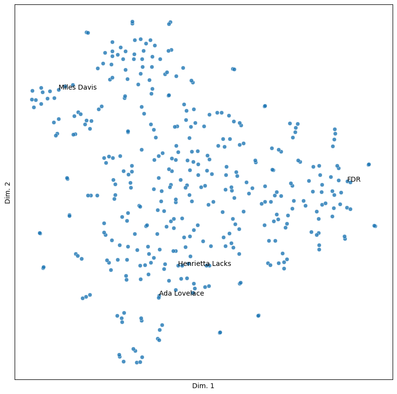
As with the toy example above, here, space has semantic value. Points that appear closer together in the graph have more similarities between them than those that are farther apart. The following pair of people illustrates this well.
roosevelts = ('FDR', 'Eleanor Roosevelt')
sim_plot(vis, labels = roosevelts)
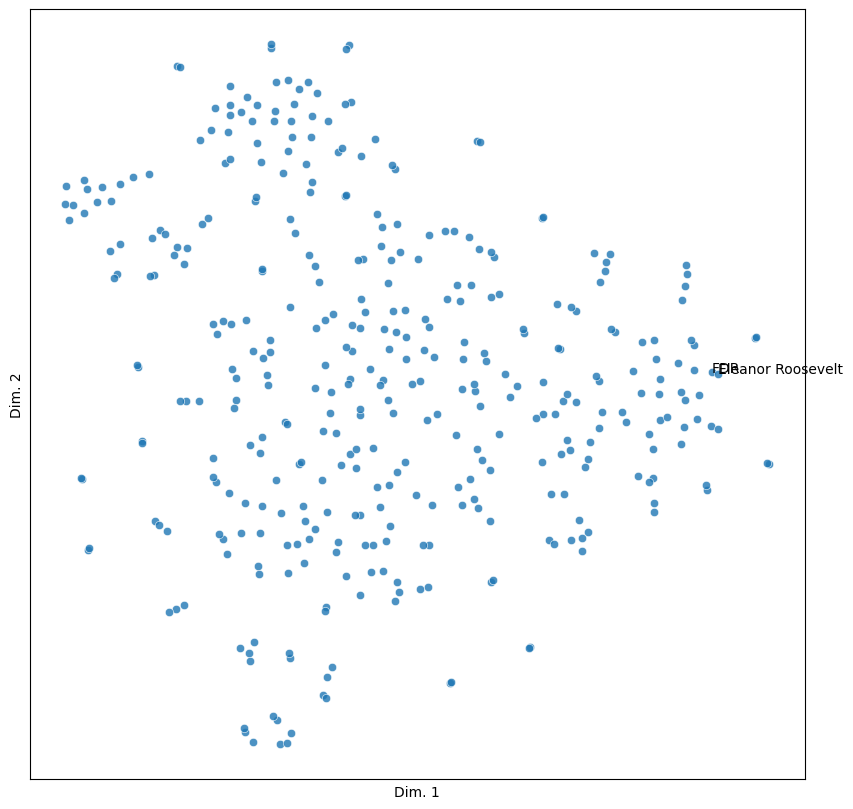
Quite close!
5.4. Clustering by Similarity#
The last topic we’ll cover in this chapter involves dividing up the feature space of our data so as to cluster the texts in our corpus into broad categories. This will provide a frame for inspecting general trends in the data, which may in turn help us understand the specificity of individual texts. For example, clustering might allow us to find various subgenres of obituaries. It could also tell us something about how the New York Times writes about particular kinds of people (their vocations, backgrounds, etc.). It may even indicate something about how the style of the obituary has changed over time.
But how to do it? Visual inspection of the graphs would be one way, and there are a few cluster-like partitions in the output above. But those cues can be misleading. It would be better to use methods that can partition our feature space automatically.
Below, we’ll use hierarchical clustering to do this. In hierarchical clustering, each data point is treated as an individual cluster before being merged with its most similar neighbor. Then, the two points are merged with another cluster and so on. Merging continues in an upward fashion, growing the size of each cluster until the process reaches a predetermined number of clusters.
Once again, scikit-learn has functionality for clustering. Below, we fit an
AgglomerativeClustering object to our similarities.
k = 3
agg = AgglomerativeClustering(n_clusters = k)
agg.fit(sims)
AgglomerativeClustering(n_clusters=3)In a Jupyter environment, please rerun this cell to show the HTML representation or trust the notebook.
On GitHub, the HTML representation is unable to render, please try loading this page with nbviewer.org.
AgglomerativeClustering(n_clusters=3)
Cluster labels are stored in the labels_ attribute of this object. We’ll
associate them with our visualization data to color points by cluster.
vis.loc[:, 'cluster'] = agg.labels_
sim_plot(vis, hue = 'cluster', labels = people)
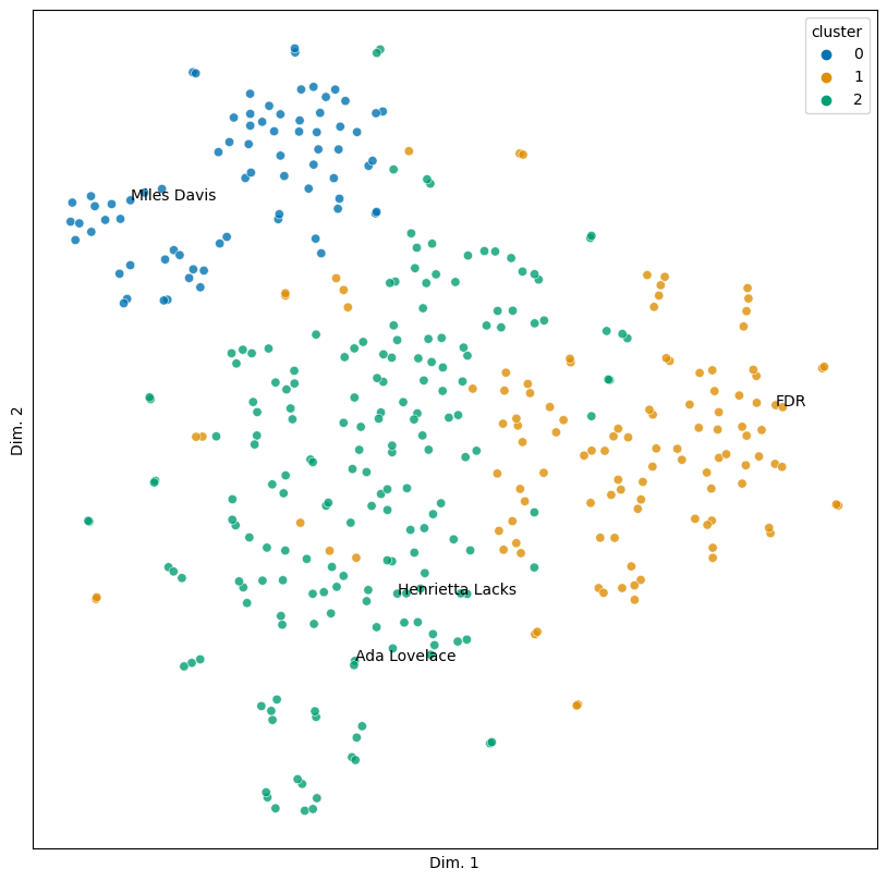
There are a few incursions of one cluster into another, but for the most part this looks pretty coherent. Let’s grab some examples of each cluster and show them.
n_sample = 5
for group in vis.groupby('cluster'):
    cluster, subset = group
    print(f"Cluster: {cluster}\n----------")
    samp = subset.sample(n_sample)
    for label in samp['label']:
        print(label)
    print("\n")
Cluster: 0
----------
Katharine Cornell
Lionel Barrymore
John Philip Sousa
Andres Segovie
Marlene Dietrich


Cluster: 1
----------
John Dewey
Queen Victoria
Dash Ended
I F Stone
Claude Pepper


Cluster: 2
----------
Bob Kane
Willa Cather
Jack London
Elizabeth Cady Stanton
Nella Larsen
Looking over these results turns up an interesting pattern: they’re tied to profession.
Cluster 0: Entertainers and performers (Billie Holiday, Marilyn Monroe, etc.)
Cluster 1: Political figures (Ghandi, Adlai Stevenson, etc.)
Cluster 2: Artists, activists, and other public figures (Helen Keller, Joseph Pulitzer, Jackie Robinson)
From an initial glance, our similarities seem to suggest that a person’s profession indicates something about the type of obituary they have.
Of course, there are exceptions. Mao Tse Tung (Mao Zedong) is in the third cluster. Though he was a poet, he was best known as a politician; the second cluster might make for a better home. Tolstoy, who is in the second cluster, presents an interesting test case. While known primarily as a novelist, he was from an aristocratic family, and his stance towards non-violence has been influential for a number of political figures. Should he therefore be in the third cluster, or is he in his rightful place here?
unexpected = ('Mao Tse Tung', 'Tolstoy')
sim_plot(vis, hue = 'cluster', labels = unexpected)
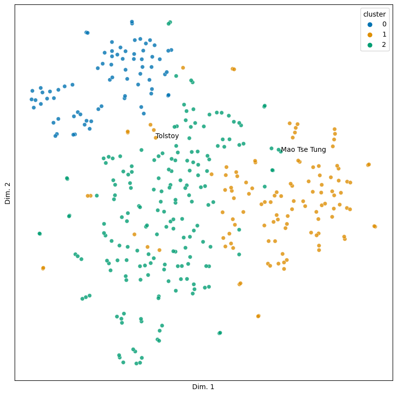
The question for both exceptions is: why? What is it about these two people’s obituaries that pushes them outside the cluster we’d expect them to be in? Is it a particular set of words? Lexical diversity? Something else?
Those questions will take us beyond the scope of this chapter. For now, it’s enough to know that text similarity prompts them. More, we can explore and analyze corpora using this metric. We’ll end, then, with this preliminary interpretation of our clusters, which later work will need to corroborate or challenge.