5 Data Visualization in R
We are here today to learn how to do data visualization in R. Some of you will have recently done the Principles of Data Visualization workshop. There you were given a checklist of questions to guide you as you create a plot, which we are going to use today. The checklist is here.
5.1 Our Friend ggplot2
We will be using the R package ggplot2 to create data visualizations. Install it via the install.packages() function. While we are at it, let’s make sure we install all of the packages that we’ll need for today’s workshop. Beyone ggplot2, we’ll use readr for reading data files, dplyr for manupulating data, and palmerpenguins provides a nice dataset.
install.packages("ggplot2")
install.packages("dplyr")
install.packages("readr")
install.packages("palmerpenguins")
ggplot2 is an enormously popular R package that provides a way to create data visualizations through a so-called “grammar of graphics” (hence the “gg” in the name). That grammar interface may be a little bit unintuitive at first but once you grasp it, you hold enormous power to quickly craft plots. It doesn’t hurt that the ggplot2 plots look great, too.
5.1.1 The Grammar of Graphics
The grammar of graphics breaks the elements of statistical graphics into parts in an analogy to human language grammars. Knowing how to put together subject nouns, object nouns, verbs, and adjectives allows you to construct sentences that express meaning. Similarly, the grammar of graphics is a collection of layers and the rules for putting them together to graphically express the meaning of your data.
5.2 Example: Palmer Penguins
Let’s look at an example. This uses data from the palmerpenguins package that you just installed (make sure to load the package with library(palmerpenguins)). It is measurements of 344 penguins, collected and made available by Dr. Kristen Gorman and the Palmer Station, Antarctica LTER, a member of the Long Term Ecological Research Network. The data package was created by Allison Horst. Before jumping in, let’s have a look at the data and the image we want to create.
## # A tibble: 6 × 8
##   species island    bill_length_mm bill_depth_mm flipper_length_mm body_mass_g
##   <fct>   <fct>              <dbl>         <dbl>             <int>       <int>
## 1 Adelie  Torgersen           39.1          18.7               181        3750
## 2 Adelie  Torgersen           39.5          17.4               186        3800
## 3 Adelie  Torgersen           40.3          18                 195        3250
## 4 Adelie  Torgersen           NA            NA                  NA          NA
## 5 Adelie  Torgersen           36.7          19.3               193        3450
## 6 Adelie  Torgersen           39.3          20.6               190        3650
## # ℹ 2 more variables: sex <fct>, year <int>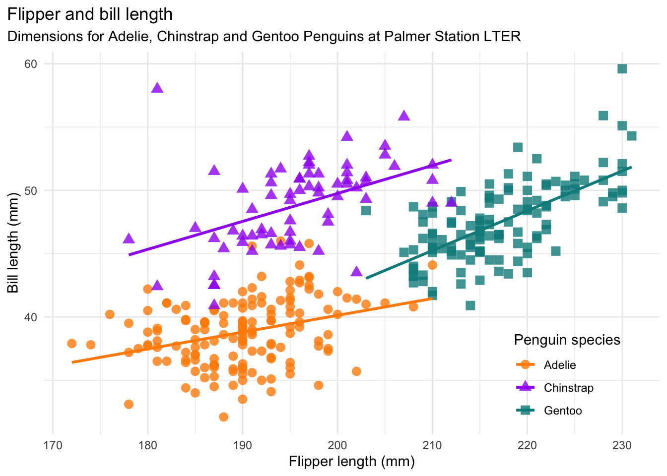
5.2.1 Examining the Plot
Referring to the graphics checklist, we see that this plot has two numerical features (bill length and flipper length), expressed using a scatter plot. There is also a categorical feature (species), which is indicated by the different colors and shapes of the plot. The plot expresses the fact that flipper length is positively associated with bill length for all thre species of penguins, but the sizes and the relationships between them are unique to each species. There is a title and a legend, the axes are labeled with units, and all of the text is in plain language. There is a risk that the data may hide the message, so a smoothing line is added to each species for clarity. The colors are accessible (avoiding red/green colorblindness issues).
This is a good dataviz, now let’s duplicate it!
5.2.2 Duplicating the Palmer Penguins Plot
Here is the code to make the plot:
# matching the Allison Horst peguins plot
ggplot(penguins) +
  aes(x = flipper_length_mm,
      y = bill_length_mm,
      color = species,
      shape = species) +
  geom_point() +
  geom_smooth(method = lm, se = FALSE) +
  xlab("Flipper length (mm)") +
  ylab("Bill length (mm)") +
  ggtitle(
    "Flipper and bill length",
    subtitle = "Dimensions for Adelie, Chinstrap, and Gentoo penguins at Palmer Station LTER"
  ) +
  labs(color = "Penguin species", shape = "Penguin species") +
  scale_color_brewer(palette = "Dark2")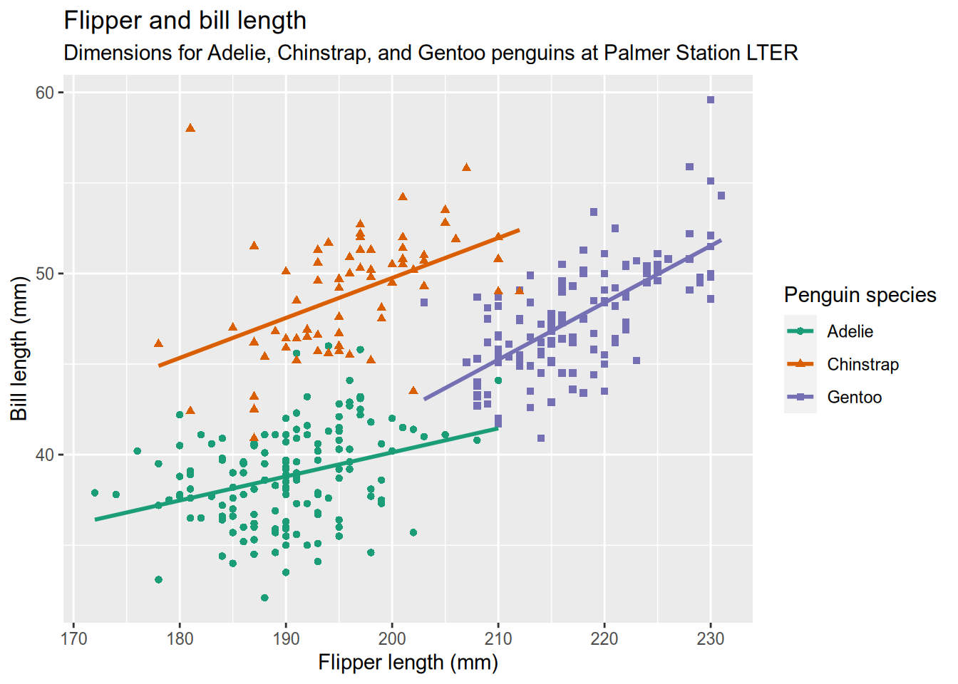
5.2.3 Analysis
This is a complicated data visualization that includes features we haven’t covered yet, so let’s go into how it works. You might have noticed how the code to make the plot is separated into a bunch of function calls, all separated by plus signs (+). Each function does something small and specific. The functions and the ability to add them together provide a powerful and flexible “grammar” to describe the desired plot.
Our plot begins the way that most do - by calling ggplot() with the data as the argument. This creates a plot object (but doesn’t draw it) and sets the data. Then we add the a so-called “aesthetic mapping” with the aes() function. An aesthetic mapping describes how features of the data map to visual channels of the plot. In our case, that means mapping the flipper length to the x (horizontal) direction, the bill length to the y (vertical) direction, and mapping species to both color and shape. Next, we add a geometry to describe what kind of marks to use in drawing the plot. Here you can refer to the table at the top of the graphics checklist that suggests geometries to use for different kinds of features. We have numeric features for both x and y, so the table suggests line, scatter (points), and heatmap. We’ve selected points (geom_point()) because we want to show the individual penguins (lines would imply a chain of connections from one penguin to the next.)
Those three parts (data, a geometry, and a map between the two) would be enough to get a basic plot that looks like this:
# Make a basic penguin plot with just data,
# a geometry, and a map between the two.
ggplot(penguins) +
  aes(x = flipper_length_mm,
      y = bill_length_mm,
      color = species,
      shape = species) +
  geom_point()
We know, though, that this plot is not complete. In particular, there is no title and the axes aren’t labeled meaningfully. Also, the clouds of points seem to hide the meaning that we are trying to convey and the colors aren’t colorblind-safe. The rest of the pieces of the plot call are meant to address those shortcomings.
We add a second geometry layer with geom_smooth(method=lm, se=FALSE), which specifies the lm method in order to draw a straight (instead of wiggly) smoother through the data. The x-axis label, y-axis label and title are set by xlab(), ylab(), and ggtitle(), respectively. We want a more informative label for the legend title than just the variable name (“Penguin Species” instead of “species”), which is handled by the labs() function. And you’ll recall from the principles of data visualization that you can use Cynthia Brewer’s Color Brewer website to select colorblind-friendly color schemes. Color Brewer is integrated directly into ggplot2, so the scale_color_brewer() function can pull a named color scheme from Color Brewer directly into your plot as the color scale.
We can begin to better understand the grammar of graphics as we consider this example. Recognize that we our data visualization conveys information via several visual channels that express data as visual marks. The geometry determines how those marks are drawn on the page, which can be set separately from the mapping. Let’s see a couple examples of that:
# placing plots via gridExtra
library(gridExtra)

# plot the Palmer penguin data with a line geometry
peng_line = ggplot(penguins) +
  aes(x = flipper_length_mm,
      y = bill_length_mm,
      color = species,
      shape = species) +
  geom_line()

# plot the Palmer penguin data with a hex heatmap geometry
peng_hex = ggplot(penguins) +
  aes(x = flipper_length_mm,
      y = bill_length_mm,
      color = species,
      shape = species) +
  geom_hex()

# place the plts side-by-side
grid.arrange(peng_line, peng_hex)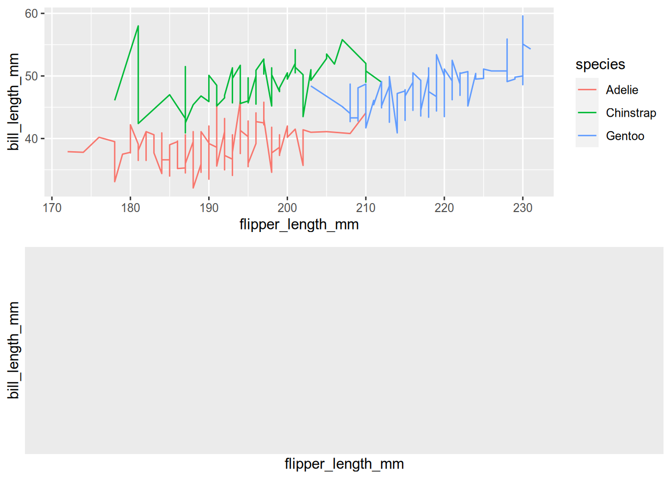
You can see how changing the geometry but not the mapping will plot the same data with a different method. Separating the mapping of features to channels from the drawing of marks is at the core of the grammar of graphics.
This separation of functions gives ggplot2 its power by allowing us to compose a small number of functions to express data in unlimited ways (kind of like poetry). Recognizing the grammar of graphics allows us to reason in a consistent way about different kinds of plots, and make intelligent assumptions about mappings and geometries.
5.3 Layers
Layers are the building blocks of the grammar of graphics. The typical pattern is that you express the idea of a plot in the grammar of graphics by adding layers with the addition symbol (+). There aren’t even that many of layers to know! Here is the list, and the name of the function(s) you’ll use to control the layer. Some of the names include asterisks because there are a lot of similar options - for instance, geometry layers include geom_point(), geom_line(), geom_boxplot(), and many more. See the comprehensive listing on the official ggplot2 website.
- Data (
ggplot2()) - provides the data for the visualization. - Aesthetic mapping (
aes()) - a mapping that indicates which variables in the data control which channel in the plot (recall from the Principle of Data Visualization that a “channel” is used in an abstract way to include things like shape, color, and line width.) - Geometry (
geom_*()) - how the marks will be drawn in the figure. - Statistical transform (
stat_*()) - alters the data before drawing - for instance binning or removing duplicates. - Scale (
scale_*()) - used to control the way that values in the data are mapped to the channels. For instance, you can control how numbers or categories in the data map to colors. - Coordinates (
coord_*()) - used to control how the data are mapped to plot axes. - Facets (
facet_*()) - used to separate the data into subplots called “facets”. - Theme (
theme()) - modifies plot details like titles, labels, and legends.
5.4 Guidelines for Graphics
I’ve attached the PDF checklist for creating good data visualizations, created by Nick Ulle of UC Davis Datalab. Download it and keep a copy around - it’s an excellent guide. I’m going to go over how the checklist translates into the grammar of graphics.
5.4.1 Data
You can’t have a data visualization without data! ggplot2 expects that your data is tidy, which means that each row is a complete observation and each column is a unique feature. In fact, ggplot2 is part of an actively developing collection of packages called the tidyverse that provides ways to create and work with tidy data. You dont have to adopt the entire tidyverse to use ggplot2, though.
5.4.2 Feature Types
The first item on the list is a table of options for geometries that are commonly relevant for a given kind of data - for instance, a histogram is a geometry that can be used with a single numeric feature, and a box plot can be used with one numeric and one categorical feature. - Should it be a dot plot? Pie plots are hard to read and bar plots don’t use space efficiently (Cleveland and McGill 1990; Heer and Bostock 2010). Generally a dot plot is a better choice.
5.4.3 Theme Guidelines
- Does the graphic convey important information? Don’t include graphics that are uninformative or redundant.
- Title? Make sure the title explains what the graphic shows.
- Axis labels? Label the axes in plain language (no variable names!).
- Axis units? Label the axes with units (inches, dollars, etc).
- Legend? Any graphic that shows two or more categories coded by style or color must include a legend.
5.4.4 Scale Guidelines
Appropriate scales and limits? Make sure the scales and limits of the axes do not lead people to incorrect conclusions. For side-by-side graphics or graphics that viewers will compare, use identical scales and limits.
Print safe? Design graphics to be legible in black & white. Color is great, but use point and line styles to distinguish groups in addition to color. Also try to choose colors that are accessible to colorblind people. The RColorBrewer and viridis packages can help with choosing colors.
5.4.5 Facet Guidelines
- No more than 5 lines? Line plots with more than 5 lines risk becoming hard-to-read “spaghetti” plots. Generally a line plot with more than 5 lines should be split into multiple plots with fewer lines. If the x-axis is discrete, consider using a heat map instead.
- No overplotting? Scatter plots where many plot points overlap hide the actual patterns in the data. Consider splitting the data into facets, making the points smaller, or using a two-dimensional density plot (a smooth scatter plot) instead.
5.5 Case Studies
We have covered enough of the grammar of graphics that you should begin to see the patterns in how it is used to express graphical ideas for ggplot2. Now we will work through some examples.
5.5.1 Counting Penguins
First, let’s revisit the penguins data. There are tree categorical features in the data: species, island, and sex. Let’s use geom_bar() to count how many penguins of each species and/or sex were observed on each island. The x-axis of the plot should be the island, but note that there are multiple values of species and sex that have the same position on that x-axis. In this case, you can use the position_dodge() or position_stack() arguments to tell ggplot2 how to handle the second grouping channel.
# count the penguins on each island
ggplot(penguins) +
  aes(x=island) +
  geom_bar() +
  xlab("Island") +
  ylab("Count") +
  ggtitle("Count of penguins on each island")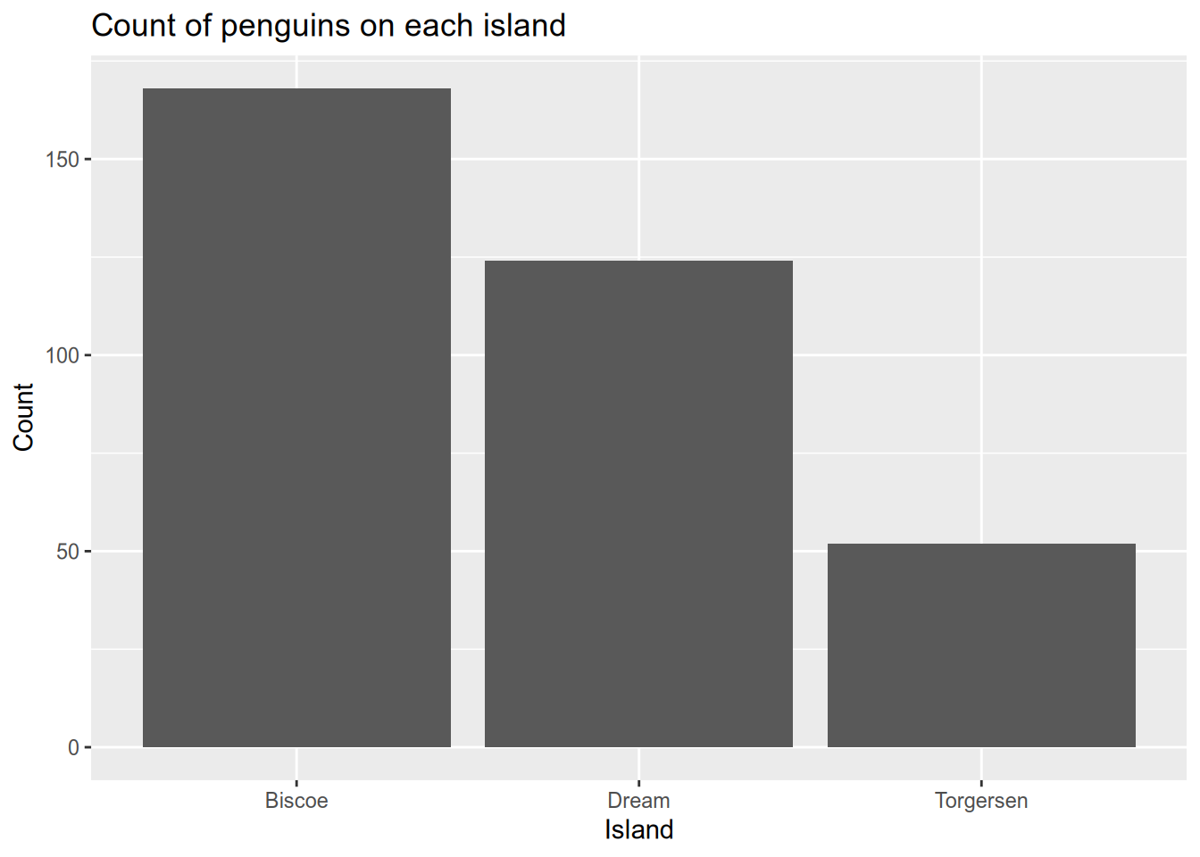
#count the penguins of each sex on each island
ggplot(penguins) +
  aes(x=island, fill=sex) +
  geom_bar(position=position_dodge()) +
  scale_fill_grey() +
  theme_bw() +
  xlab("Island") +
  ylab("Count") +
  ggtitle("Count of penguins on each island by sex")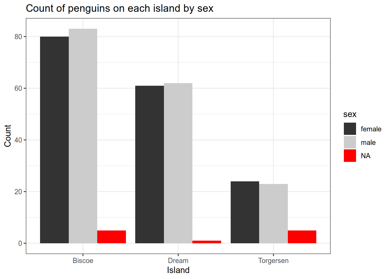
Alternatively, you can use facets to separate the data into multiple plots based on a data feature. Let’s see how that works to facet the plots by species.
One way to show more information more clearly in a plot is to break the plot into pieces that each show part of the information. In ggplot2, this is called faceting the plot. There are two main facet functions, facet_grid() (which puts plots in a grid), and facet_wrap(), which puts plots side-by-side until it runs out of room, then wraps to a new line. We’ll use facet_wrap() here, with the first argument being ~species. This tells ggplot2 to break the plot into pieces by plotting the data for each species separately.
#count the penguins of each species on each island
ggplot(penguins) +
  aes(x=island) +
  geom_bar() +
  scale_fill_grey() +
  theme_bw() +
  xlab("Island") +
  ylab("Count") +
  ggtitle("Count of penguins on each island by species") +
  facet_wrap(~species, ncol=3)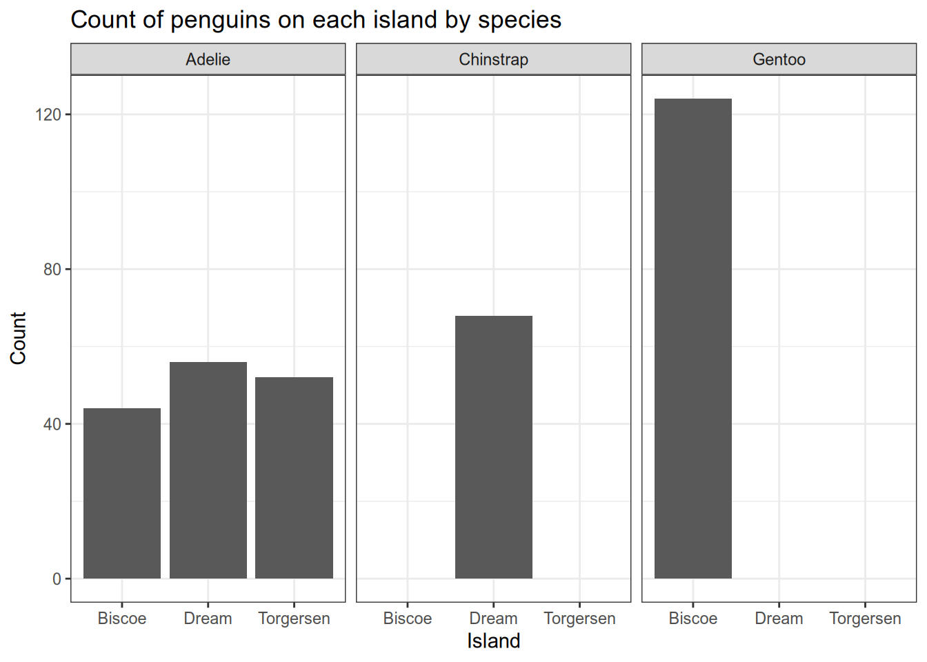
5.5.2 Experimental Data with Error Bars
Here’s an example that recently came up in my office hours. You’ve done an experiment to see how mice with two different genotypes respond to two different treatments. Now you want to plot the mean response of each group as a column, with error bars indicating the standard deviation of the mean. You also want to show the raw data. I’ve simulated some data for us to use - download it here.
This one is kind of complicated because you have to tell ggplot2 how to calculate the height of the columns and of the error bars. This involves cr
mice_geno = read_csv("data/genotype-response.csv")

# show the treatment response for different genotypes
ggplot(mice_geno) +
  aes(x=trt,
      y=resp,
      fill=genotype) +
  scale_fill_brewer(palette="Dark2") +
  geom_bar(position=position_dodge(),
           stat='summary',
           fun='mean') +
  geom_errorbar(fun.min=function(x) {mean(x) - sd(x) / sqrt(length(x))},
               fun.max=function(x) {mean(x) + sd(x) / sqrt(length(x))},
               stat='summary',
               position=position_dodge(0.9),
               width=0.2) +
  geom_point(position=
               position_jitterdodge(
                 dodge.width=0.9,
                 jitter.width=0.1)) +
  xlab("Treatment") +
  ylab("Response (mm/g)") +
  ggtitle("Mean growth response of mice by genotype and treatment")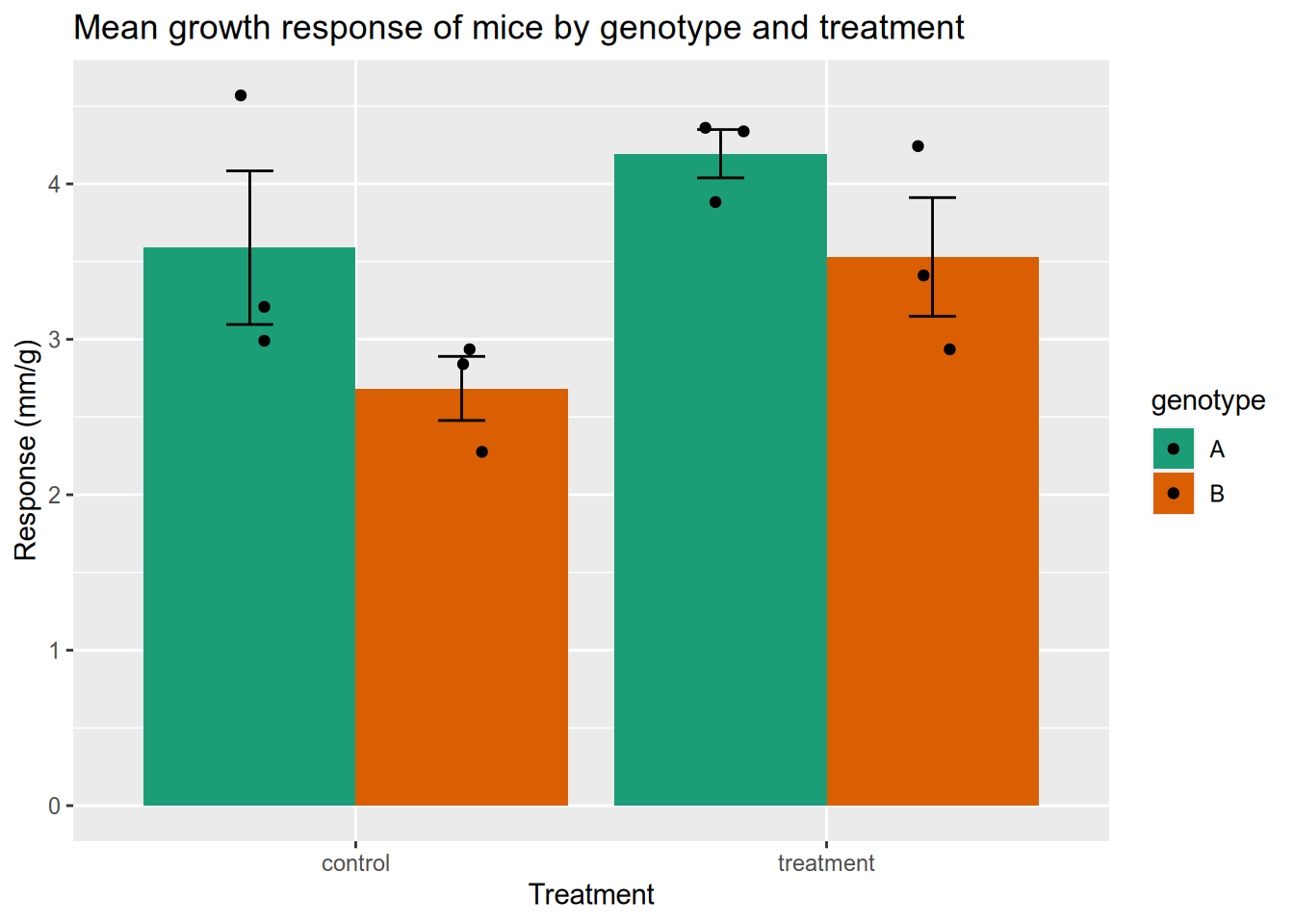
5.5.3 Bird Flu Mortality
People mail dead birds to the USDA and USGS, where scientists analyze the birds to find out why they died. Right now there is a bird flu epidemic, and the USDA provides public data about the birds in whom the disease has been detected. You can access the data here or see the official USDA webpage here. After you download the data, we will load the data and do some visualization.
# load data directly from the USDA website
flu <- read_csv("data/hpai-wild-birds-ver2.csv")
flu$date <- mdy(flu$`Date Detected`)

# plot a histogram of when bird flu was detected
ggplot(flu) +
  aes(x = date) +
  geom_histogram() +
  ggtitle("Bird flu detections in wild birds") +
  xlab("Date") +
  ylab("Count")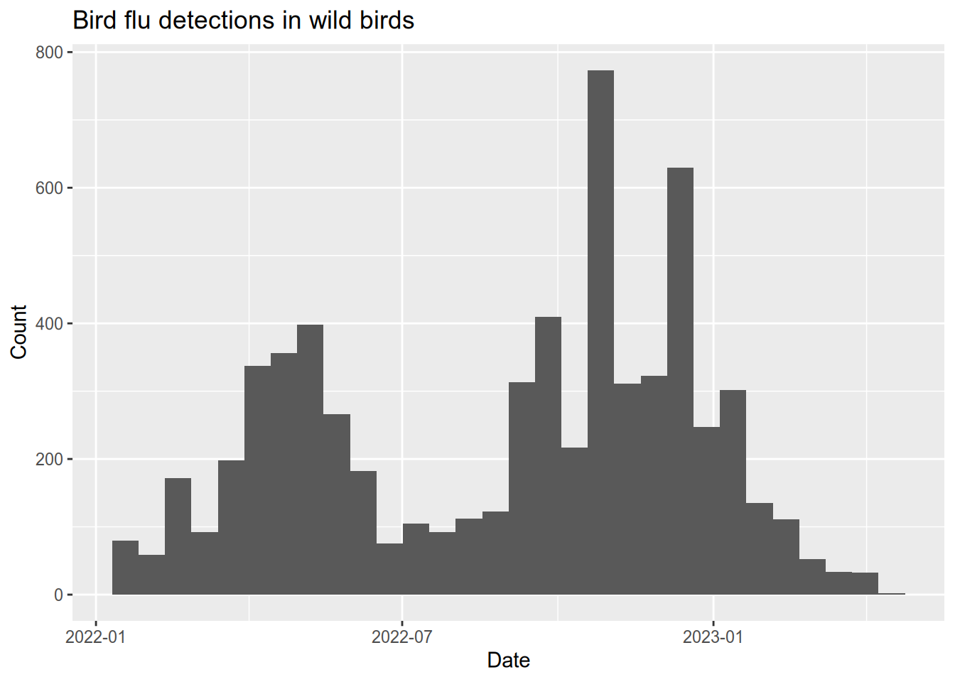
# plot a histogram of when bird flu was detected
ggplot(flu) +
  aes(x = date, fill = `Sampling Method`) +
  geom_histogram() +
  ggtitle("Bird flu detections in wild birds") +
  xlab("Date") +
  ylab("Count")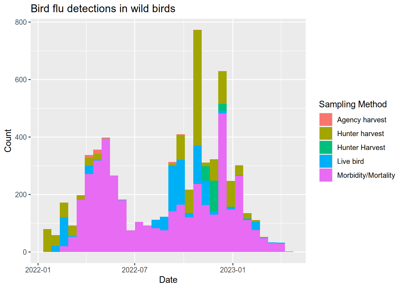
# bar chart shows how the bird flu reports compare between west coast states
subset(flu, State %in% c("California", "Oregon", "Washington")) |>
  ggplot() +
  aes(x = State, fill = `Sampling Method`) +
  stat_count() +
  geom_bar() +
  ggtitle("Bird flu detections in wild birds (West coast states)") +
  ylab("Count")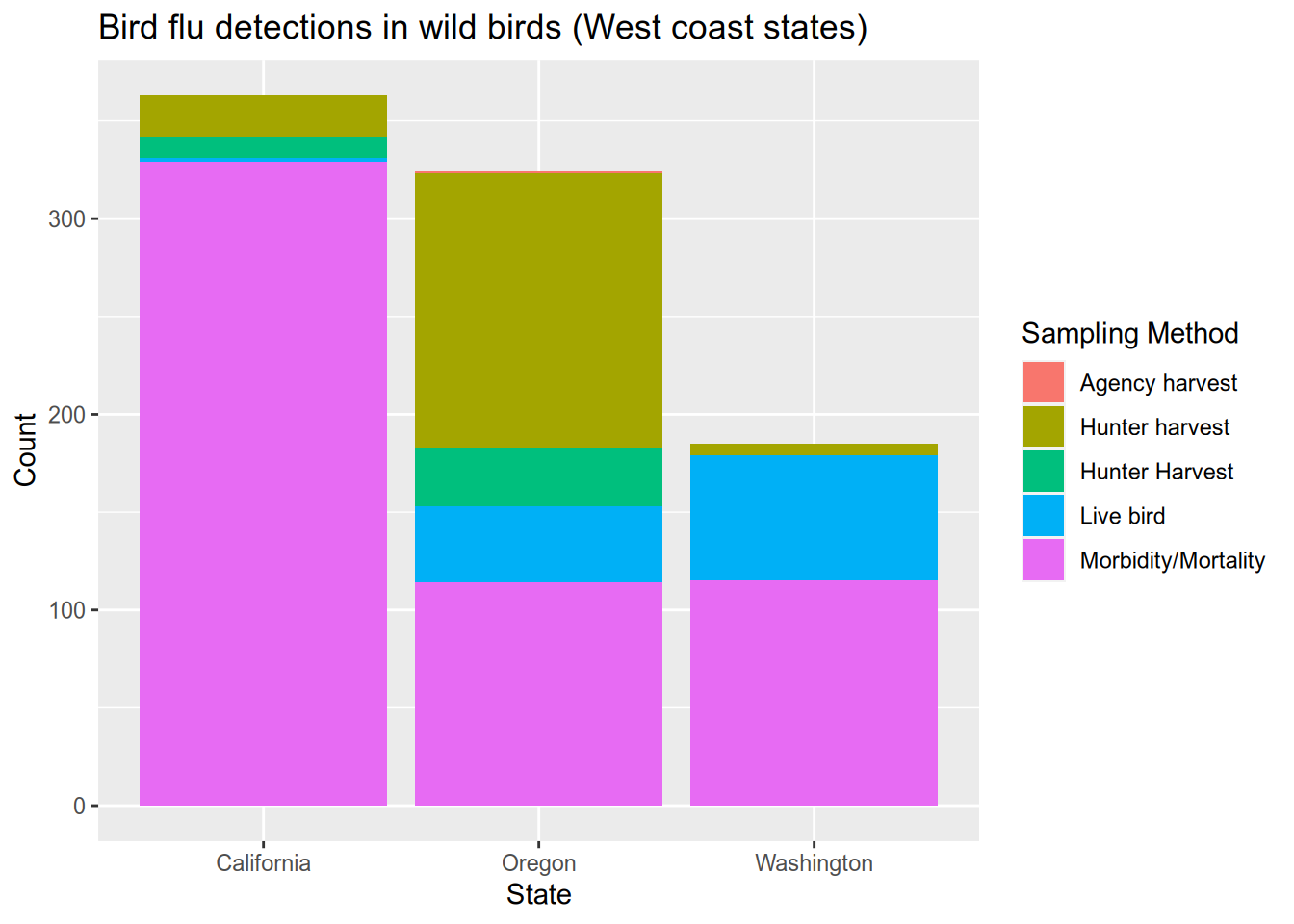
Let’s compare the bird flu season to the human flu season. Download hospitalization data for the 2021-2022 and 2022-2023 flu seasons from the CDC website here or see the official Centers for Disease Control website here. After you download the data, we will see how adding a second data series works a little differently from the first. That’s because composing data, aesthetic mapping, and geometry with addition only works when there is no ambiguity about which data series is being mapped or drawn.
After downloading the data, there is some work required to adjust the dates and change the hospitalization rate from cases per 100,000 to cases per 10 million, which better matches the scale of the bird flu data.
# processing CDC flu data:
cdc <- read_csv("data/FluSurveillance_Custom_Download_Data.csv", skip = 2)
cdc$date <- as_date("1950-01-01")
year(cdc$date) <- cdc$`MMWR-YEAR`
week(cdc$date) <- cdc$`MMWR-WEEK`


# get flu hospitalization counts that include all race, sex, and age categories
cdc_overall <- subset(
  cdc,
  `AGE CATEGORY` == "Overall" &
    `SEX CATEGORY` == "Overall" &
    `RACE CATEGORY` == "Overall"
)

# convert the counts to cases per 10 million
cdc_overall$`WEEKLY RATE` <- as.numeric(cdc_overall$`WEEKLY RATE`) * 100
# remake the plot but add a new geom_line() with its own data
ggplot(flu) +
aes(x = date, fill = `Sampling Method`) +
geom_histogram() +
geom_line(data = cdc_overall,
mapping = aes(x = date, y = `WEEKLY RATE`),
inherit.aes = FALSE) +
ggtitle("Bird flu detections and human flu hospitalizations") +
xlab("Date") +
ylab("Count") +
xlim(as_date("2022-01-01"), as_date("2023-05-01"))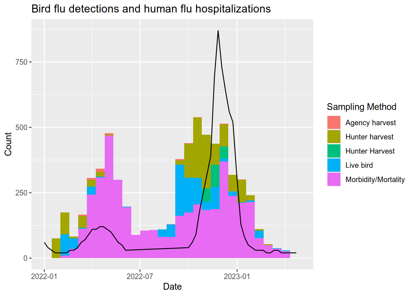
5.5.4 Small Business Loans
The US Small Business Administration (SBA) maintains data on the loans it offers to businesses. Data about loans made since 2020 can be found at the Small Business Administration website, or you can download it from here. We’ll load that data and then explore some ways to visualize it. Since the difference between a $100 loan and a $1000 loan is more like the difference between $100,000 and $1M than between $100,000 ad $100,900, we should put the loan values on a logarithmic scale. You can do this in ggplot2 with the scale_y_log10() function (when the loan values are on the y axis).
# load the small business loan data
sba <- read_csv("data/small-business-loans.csv")

# check the SBA data to see the data types, etc.
head(sba)
## # A tibble: 6 × 39
## AsOfDate Program BorrName BorrStreet BorrCity BorrState BorrZip BankName
## <dbl> <chr> <chr> <chr> <chr> <chr> <chr> <chr>
## 1 20230331 7A Mark Dusa 3623 Swal… Sylvania OH 43560 The Hun…
## 2 20230331 7A Shaddai Harris 614 Valle… Arlingt… TX 76018 PeopleF…
## 3 20230331 7A Aqualon Inc. 7180 Agen… Tipp Ci… OH 45371 The Hun…
## 4 20230331 7A Redline Resta… 2450 Cher… Saint C… FL 34772 SouthSt…
## 5 20230331 7A Meluota Corp 2702 ASTO… ASTORIA NY 11102 Santand…
## 6 20230331 7A Sky Lake Vaca… 15 Nestle… Laconia NH 03246 TD Bank…
## # ℹ 31 more variables: BankFDICNumber <dbl>, BankNCUANumber <dbl>,
## # BankStreet <chr>, BankCity <chr>, BankState <chr>, BankZip <chr>,
## # GrossApproval <dbl>, SBAGuaranteedApproval <dbl>, ApprovalDate <chr>,
## # ApprovalFiscalYear <dbl>, FirstDisbursementDate <chr>,
## # DeliveryMethod <chr>, subpgmdesc <chr>, InitialInterestRate <dbl>,
## # TermInMonths <dbl>, NaicsCode <dbl>, NaicsDescription <chr>,
## # FranchiseCode <chr>, FranchiseName <chr>, ProjectCounty <chr>, …# boxplot of loan sizes by business type
subset(sba, ProjectState == "CA") |>
ggplot() +
aes(x = BusinessType, y = SBAGuaranteedApproval) +
geom_boxplot() +
scale_y_log10() +
ggtitle("Small Business Administraton guaranteed loans in California") +
ylab("Loan guarantee (dollars)")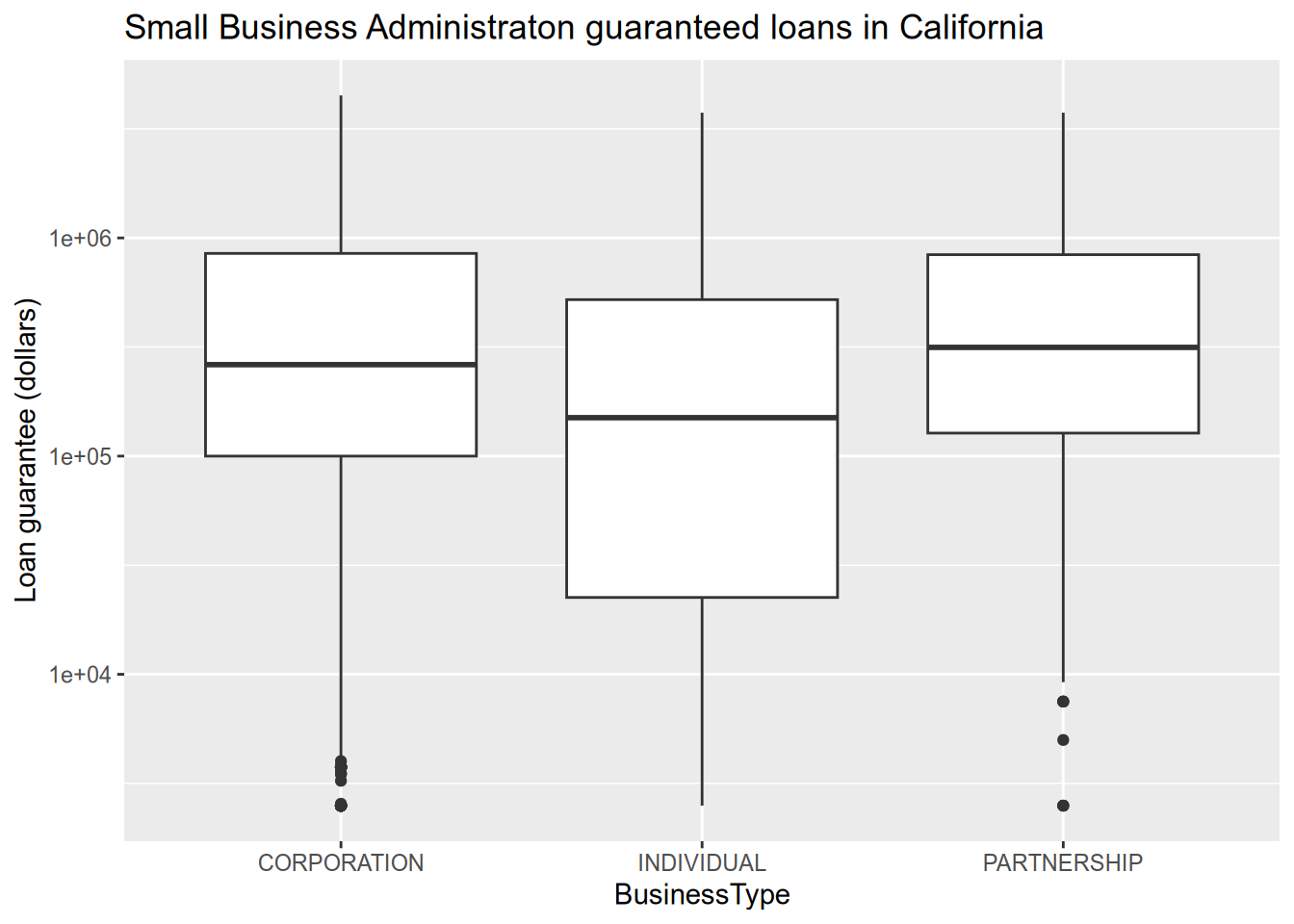
# relationship between loan size and interest rate
subset(sba, ProjectState == "CA") |>
  ggplot() +
  aes(x = GrossApproval, y = InitialInterestRate, ) +
  geom_point() +
  facet_wrap(~BusinessType, ncol = 3) +
  scale_x_log10() +
  ggtitle("Interest rate as a function of loan size") +
  xlab("Loan size (dollars)") +
  ylab("Interest rate (%)")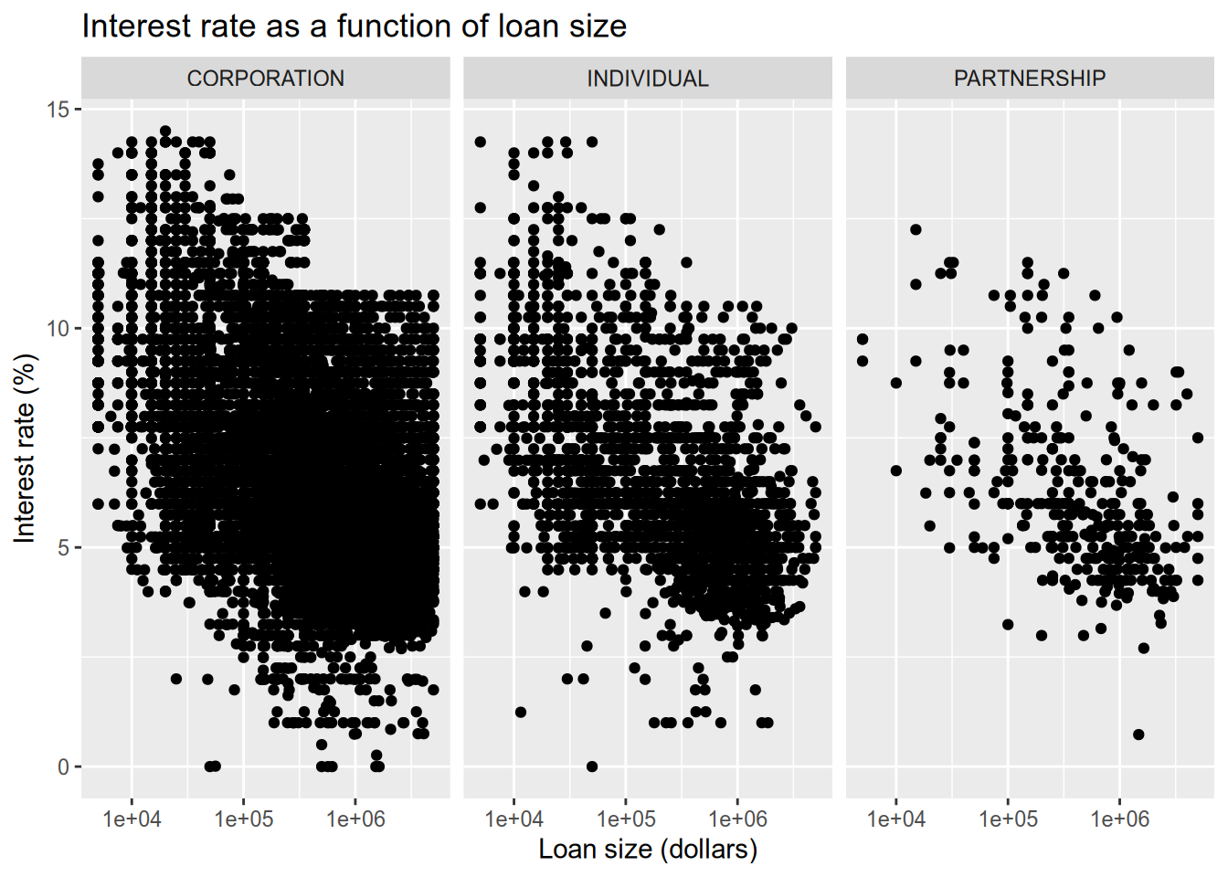
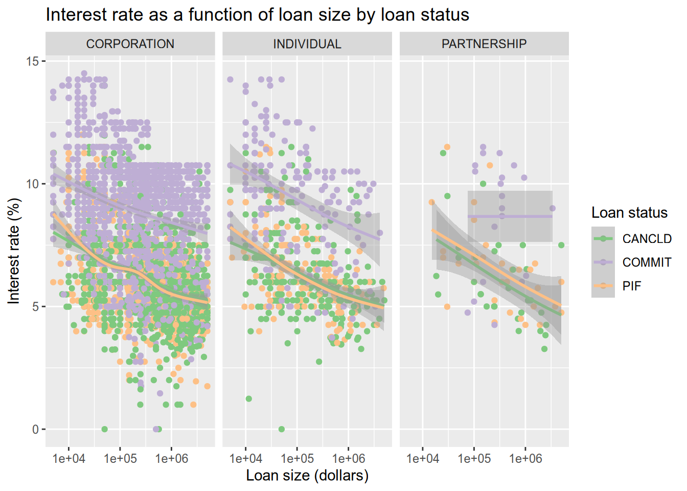
Now let’s color the points by the loan status. Thankfully, ggplot2 integrates directly with Color Brewer (colorbrewer2.org) to get better color palettes. We will use the Accent color palette, which is just one of the many options that can be found on the Color Brewer site.
There are a lot of data points, which tent to largely overlap and hide each other. We use a smoother (geom_smooth()) to help call out differences that would otherwise be lost in the noise of the points.
# color the dots by the loan status.
subset(sba, ProjectState == "CA" & LoanStatus != "EXEMPT" & LoanStatus != "CHGOFF") |>
  ggplot() +
  aes(x = GrossApproval, y = InitialInterestRate, color = LoanStatus) +
  geom_point() +
  geom_smooth() +
  facet_wrap(~BusinessType, ncol = 3) +
  scale_x_log10() +
  ggtitle("Interest rate as a function of loan size by loan status") +
  xlab("Loan size (dollars)") +
  ylab("Interest rate (%)") +
  labs(color = "Loan status") +
  scale_color_brewer(type = "qual", palette = "Accent")